UX PROJECT


StarWords

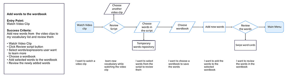
Simple, Intuitive, Fun way to learn new languages

Project COntext

Created a Language learning App that helps millennials learn new vocabulary quickly and effectively in a native context

Brief
Role
Product Designer
Date
March - June 2020
Methods
Competitive Analysis, User Interview, User persona, User stories,
Usability test, Affinity Diagram
Challenge
Design for a specific circumstance: Every detail of the users’ interaction with this service and characteristics of the target user demographics needs to be considered.
Tools
Figma, Marvel, Miro, Google survey
Problem statement
Research and surveys have shown that millennials are workaholics. As a result of their busy lifestyles and lack of rest, many millennials have become addicted to the short videos on TikTok.  Currently, as millennials have become increasingly exposed to a globalized world, and are connected now more than ever, many millennials are seeking to learn new languages for the sake of self-improvement. However, they are also seeking new ways to learn vocabulary and languages swiftly and effectively within brief amounts of time. As such, it is no longer practical for them to use traditional ways of learning new languages such as through the use of physical books, vocabulary cards, and games.
Process
I followed the User-Centered Design process by first conducting competitor research. After evaluating a few existing vocabulary learning mobile apps, I conducted user research to better understand user pain points. Based on the interview findings, I defined the problem and hypothesis and proceeded with the the ideation phase. From sketches all the way to high fidelity prototypes, I gradually created the first version of the application. I conducted usability tests and improved the app based on the feedback I received.
Solution
Immersive Exposure to Words by Short Videos

Starwords provides vivid and highly relevant video clips in which native speakers have normal conversations in everyday life. Users can work on developing accurate pronunciation, inflection, and intonation.  
Appealing Reminders

Starwords empowers users to expand their vocabulary consistently and helps them remain motivated to regularly practice their new language with fun and enjoyable reminders. One feature enables users to save words to a list to memorize and swipe one way to add a word to this list or swipe the other way to delete it!
result
I conducted a usability test with the initial wireframes with 4 participants and collected meaningful feedback on potential app improvements. The most critical observations were about grammar errors and certain impracticalities related to the buttons. So, I set up action points for every single observation. 

Usability Test Result

This is a really good idea and I enjoyed it.
It encourages interaction.
Be careful with grammatical errors in the app

Shez Sheikh

Consultant

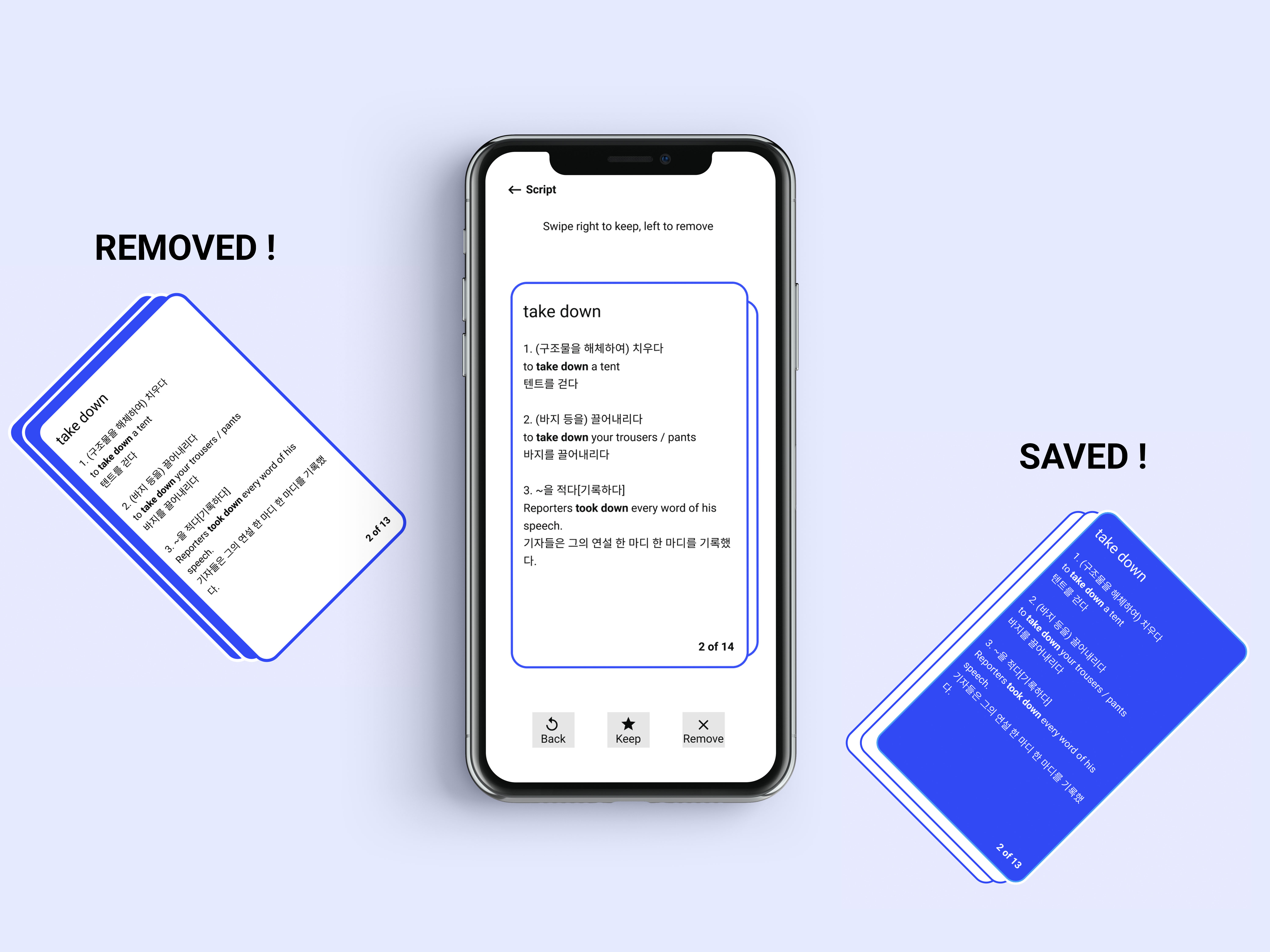
To increase retention, I would add something that allows users to practice by quizzing or having to fill in incomplete sentences.

Garret

Founder & Leader


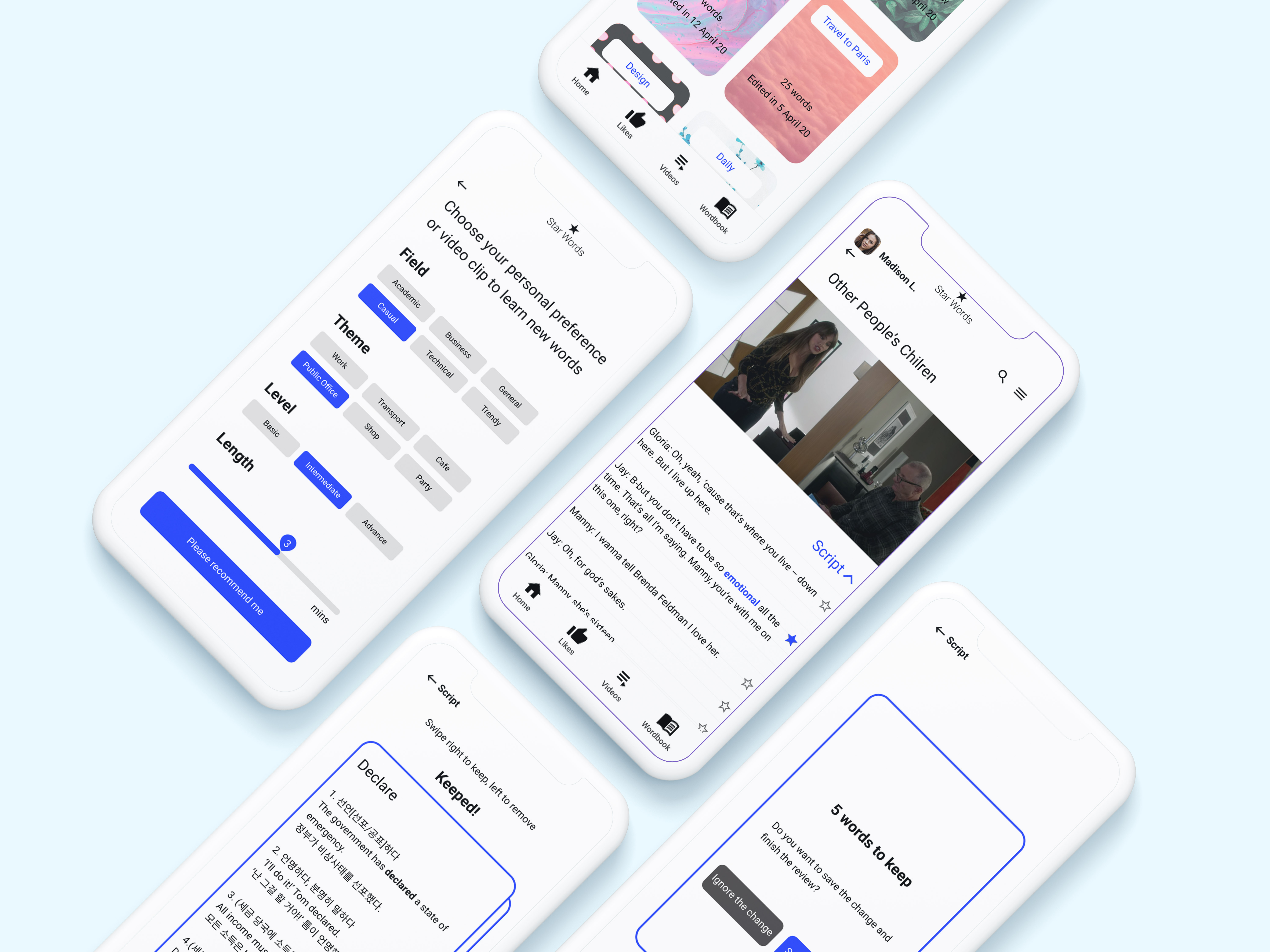
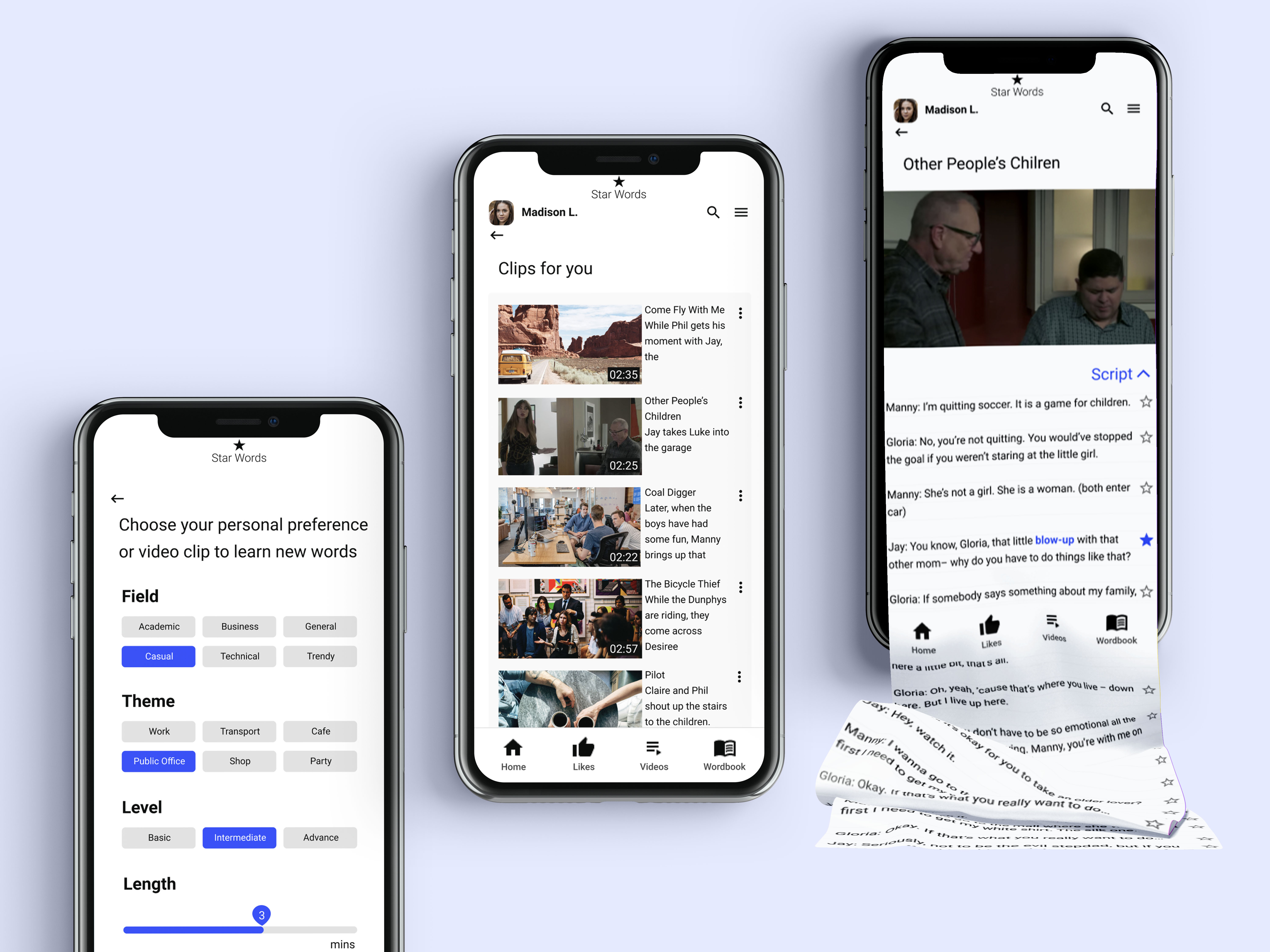
I would love if the navigation bar had labels, which would help me navigate the app!

Emma Tran

Designer
competitive analysis
Understanding the business
To start with the research, I analysed 3 direct competitors (Hello Talk, Memrise, Flashcards) and focused on the pros and cons of each. 
Competitive analysis of 3 language learning apps
I learned that:
1) With existing apps or study materials it takes a lot of time to learn and master new words
2) It’s often difficult to review newly learned words in the existing apps
3) Traditional vocabulary lists don’t help you to use the language in its original, native context.
user interview
Understanding the people focused on doing, thinking, feeling
I conducted a user interview with 3 participants to understand the process of how people learn a new language using an app. To identify the pain points from the user's perspective, I summarized the interview notes to categorize what interviewees were doing, thinking, and feeling.
User Interview Result
Opportunities I found though the interview:
1) To provide a multi-sensory and receptive skills-focused way of learning
2) To cover a broader range of topics and levels
3) To present new vocabulary in a native context and demonstrate their usage
User flow
Brainstorming the possible solution for the users
I have drawn upon research that I’ve conducted in the past to develop multiple solutions that cater towards a target audience composed of people who are busy and have little time to study new languages.
I designed three separate user flow diagrams to explore the feasibility of each potential solution and determine users’ needs and behaviors at each step.
User Flow of ''Watch desired video clip"
User Flow of ''Add words to the wordbook"
usability test
Evaluating the low-fidelity prototypes

Our goals for the testing were to:
1) Test the usability of the two main features of the StarWords apps 
2) Test the discoverability and usability of the overall progression of tasks
3) Learn about users’ behaviors, especially around how they interact with the prototypes

Usability Test Result

Summarized findings and recommendations:
1) Certain impracticalities related to the buttons should be removed by labeling on each button to indicate it’s function to the user.
2) The title of each screen and an information label on the navigation bar are both necessary to make the app more user-friendly.
3) I should take care to avoid grammatical errors because it can diminish the reliability of the app.  

iteration
Evaluate the low-fidelity prototypes
I started prototyping Starwords based on the narrowed down-ideas which were identified in the user flow. I created the low-fidelity prototype and moved on to evaluate on that.

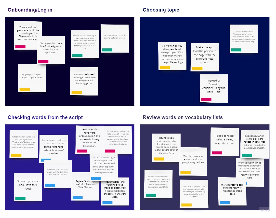
Key Finding #1: People don’t always understand what icons indicate
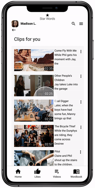
Some test participants didn’t know which icon to click on in the navigation bar at first. However, once they found it the process was smooth. Adding labels on the navigation bar would help users navigate the app more easily.  

Key Finding #2: Unclear terminology ruins the user experience
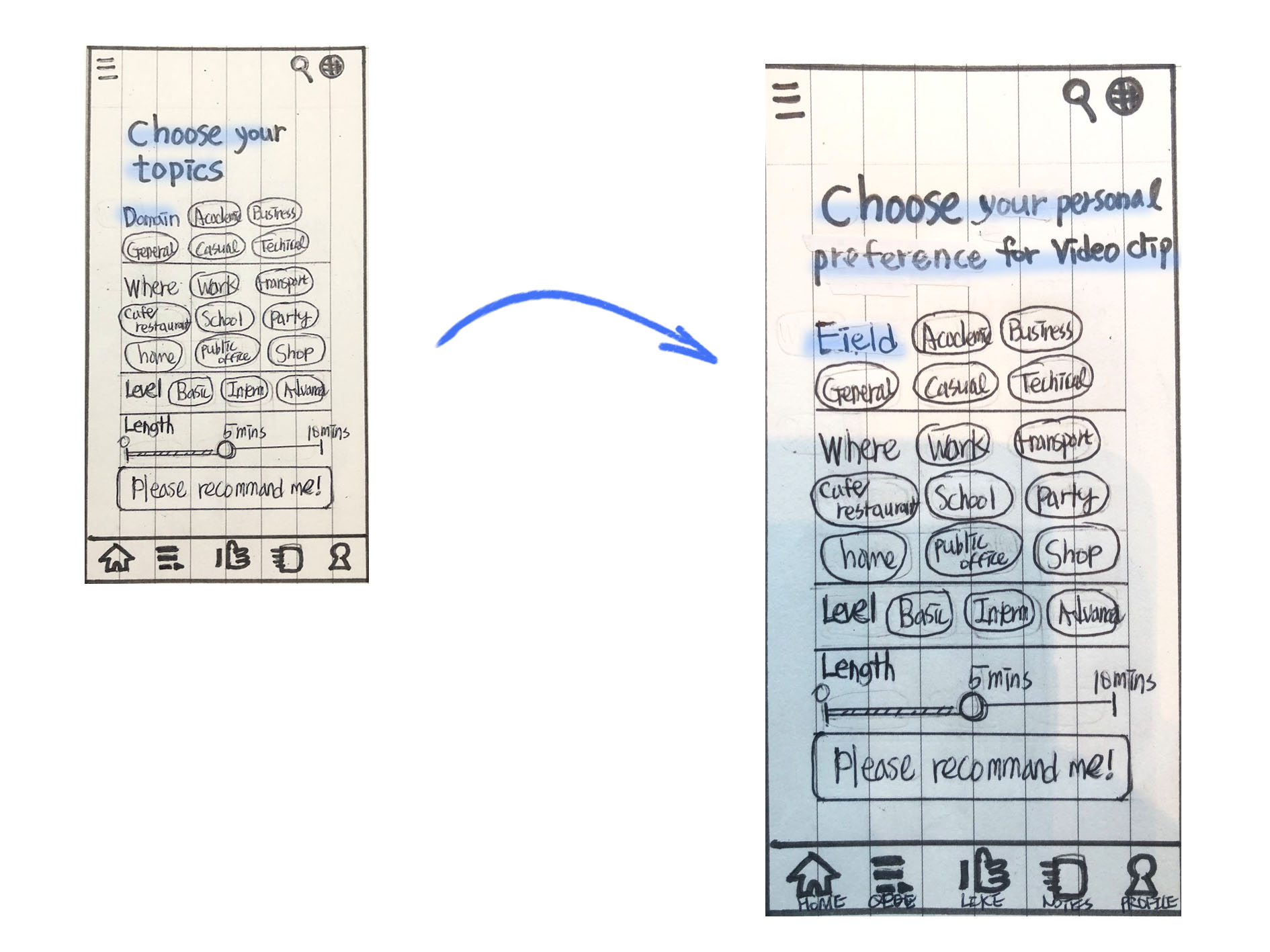
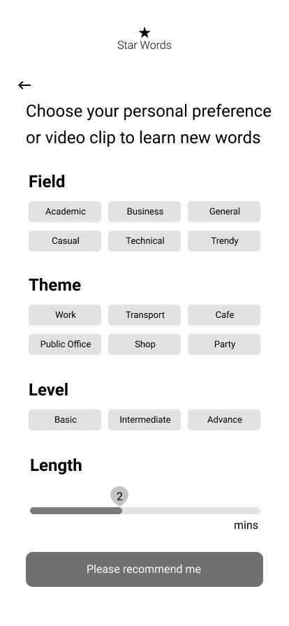
Several terms used in the buttons were not clear enough to indicate their function. People got confused about what “choose a topic” meant and didn’t know it would take them to a video. So I changed it and replaced 'Domain' to ‘Fields’ on another screen.  

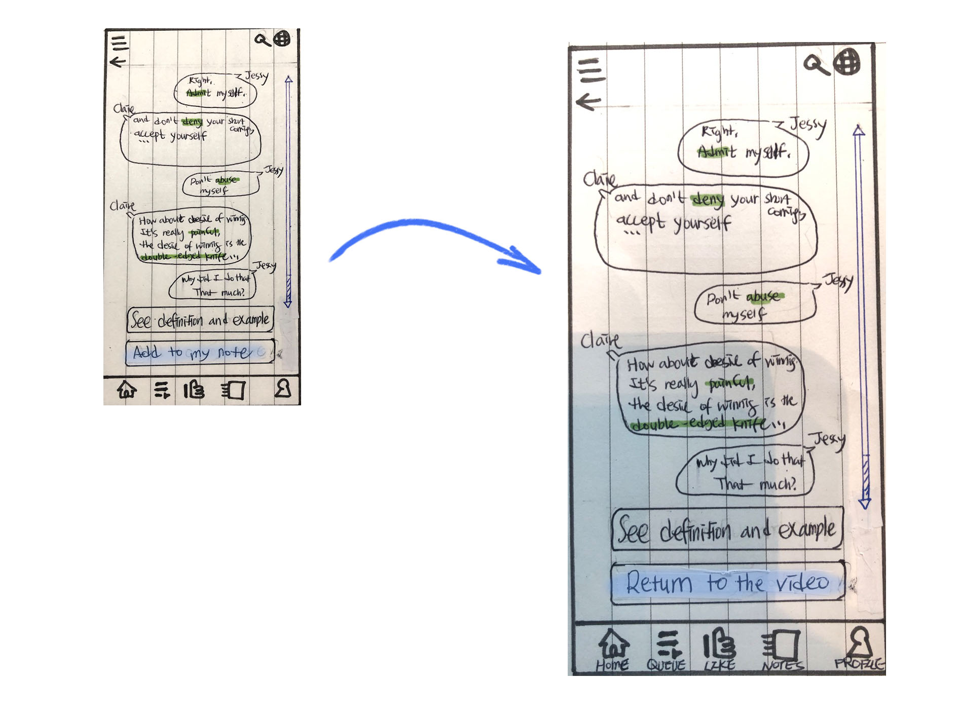
Key Finding #3: the size of CTA buttons affects users’ behaviors
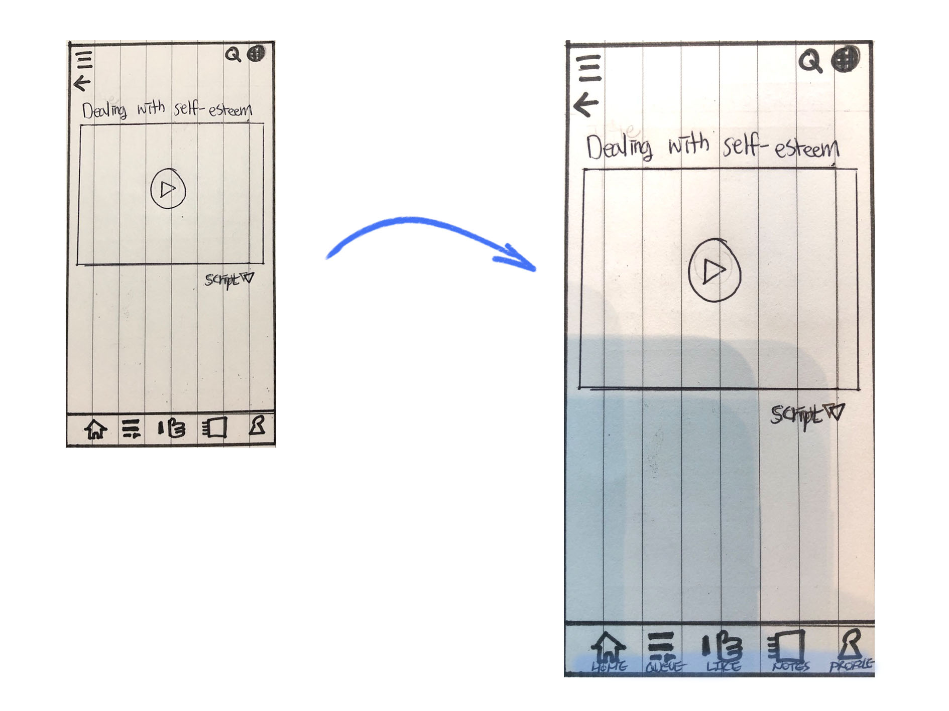
Some users were not sure if they needed the “another clip” button, since the "you may like" section was almost the same feature, and this overlap confused them. I changed the location and size of the buttons to make them work exclusively. (Remove “Another clip” button and make “Review Words” button bigger , Replace “Add to my note” button to “Return to the video” button)

FINAL DEsign
From paper drawing to digital pixels
Based on the key findings I synthesized through conducting the usability test, I iterated on the design and upgraded the prototype from mid-fidelity to high-fidelity.

From the start to selecting preference

Onboarding
Sign in and Select Language
Choose preference

Key Functions with Interaction

Watching video and selecting words to learn
Review words by swiping
Retrospective
I would like to share the insight that I’ve gained through designing and implementing this project. I not only learned an exceptional amount of information about user interviews and usability tests, but I also was inspired by the feedback that I received to continue improving my work. 

Additionally, I learned how significant it is to define the right persona, because it is a pivotal factor that defines the trajectory of a project from its earliest stages until its final stages when you are implementing solutions.

As a designer, I believe that I should be flexible and open to quickly changing my designs when I obtain new information or learn of better solutions. 

Lastly, I have learned that competitive research serves as an effective way to develop strategies, because it offered me the ability to learn basic UX concepts by utilizing and analyzing existing apps.