A responsive expert app that offers trustworthy advice to working professionals
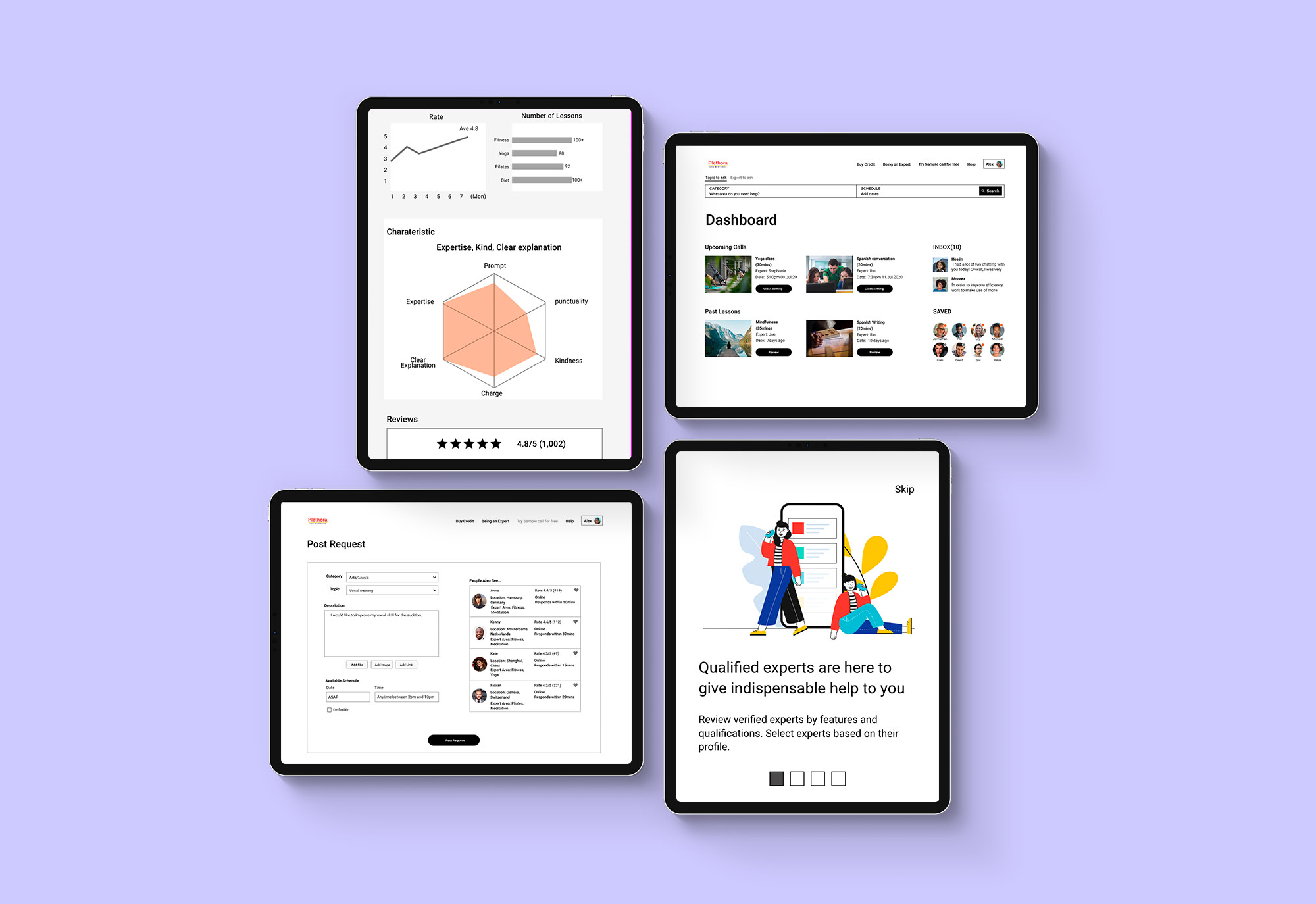
Provides elaborated review systems, instant booking, and simple payment plans
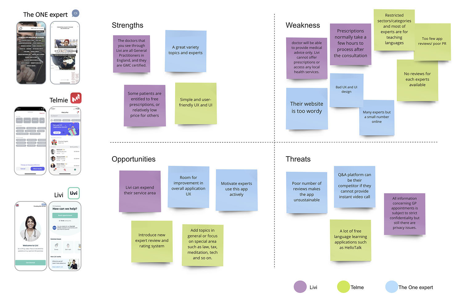
competitive analysis
I conducted SWOT analysis of some of the major competitors such as Telmie, The ONE, and Livi as they all offer a video-call with an expert on a variety of topics. In a broader perspective, Google and Youtube can be competitors as they can provide solutions in different ways. One is a search-engine whereas the other is a recorded video platform, I researched their products’ pros and cons.
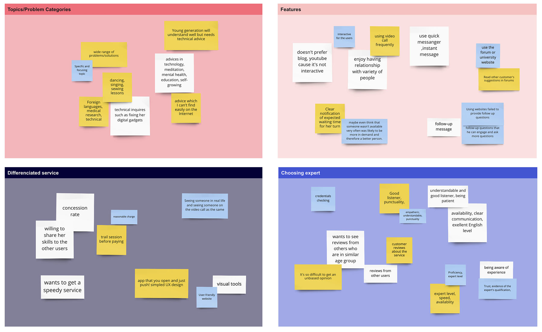
User interview
The online interview was conducted to ask follow-up questions and to discuss in-depth the participant’s overall impression of the topic. Through the online interview, I collected a significant amount of insights into the users and find a way to fix problems.
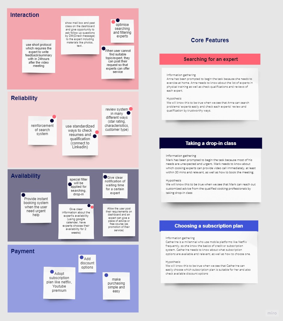
core features
Through the user survey and interview, I found pain points and individual needs. I then divided these findings into four main categories: Interactions, reliability, availability, and payment. Based on the insight, I came up with possible solutions and organized them according to impact and effort to prioritize 3 core features.
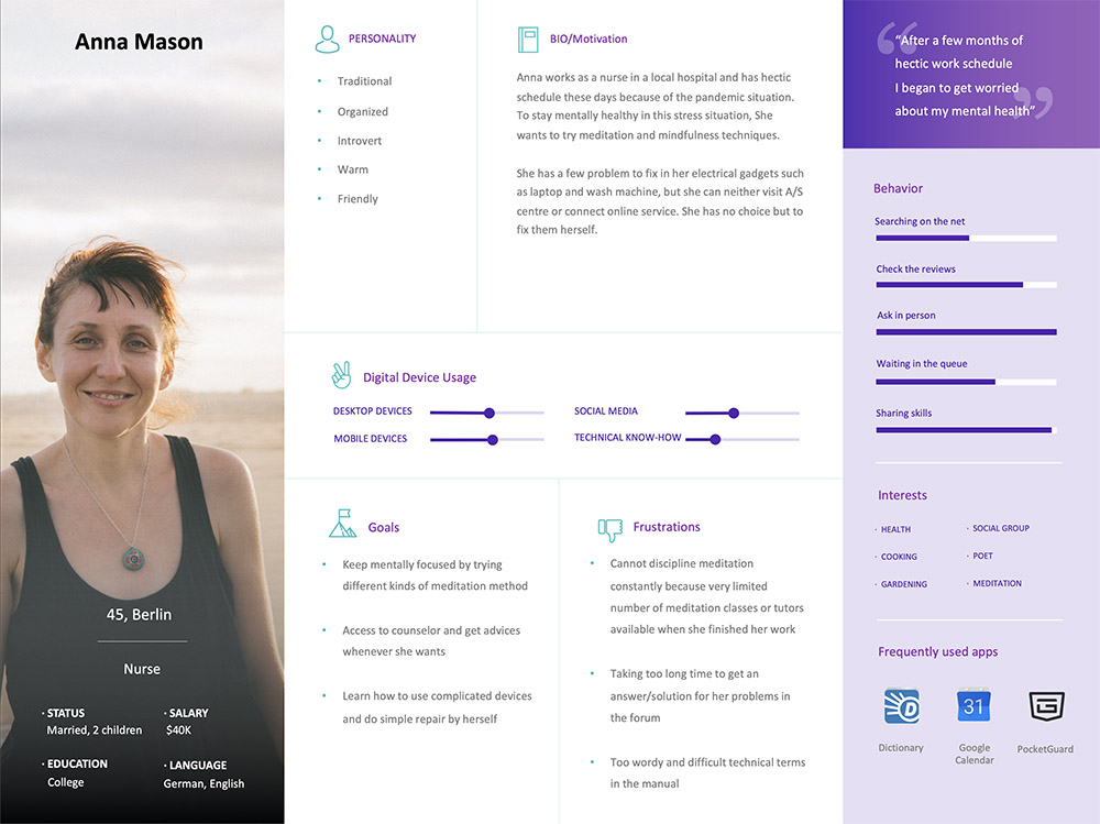
User persona
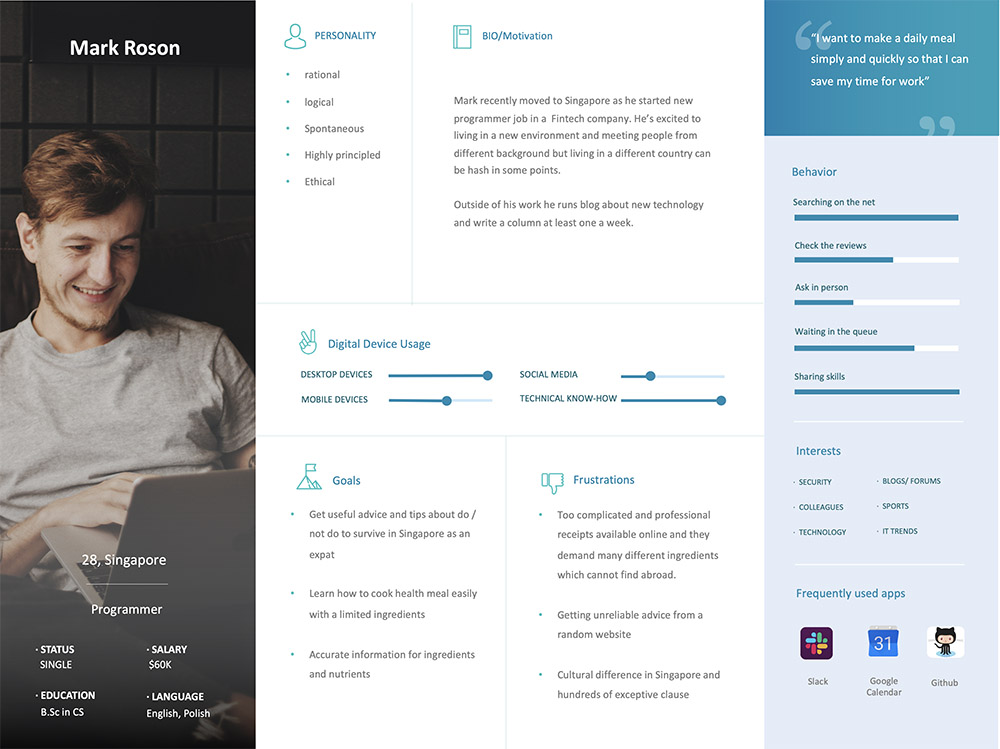
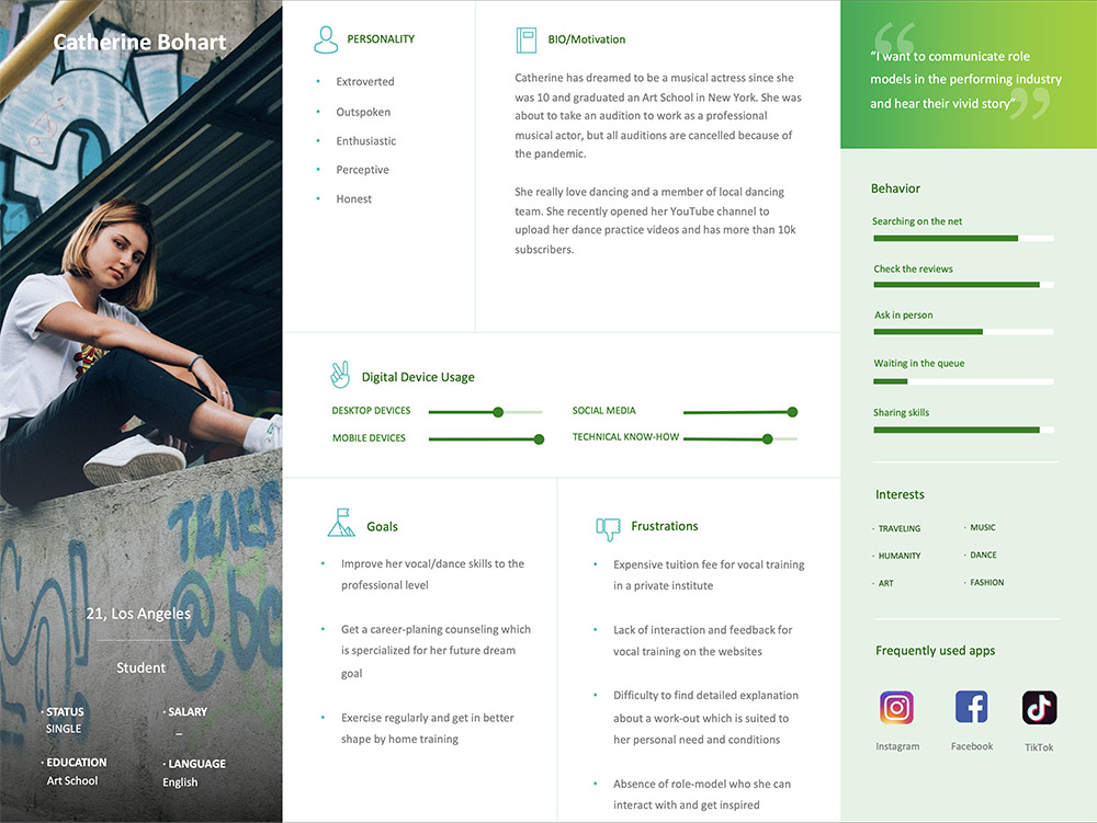
Three primary personas emerged from my user research which involved conducting user surveys and interviews. These personas help to understand the general behavior of our target audience as well as their needs and goals.


user journey
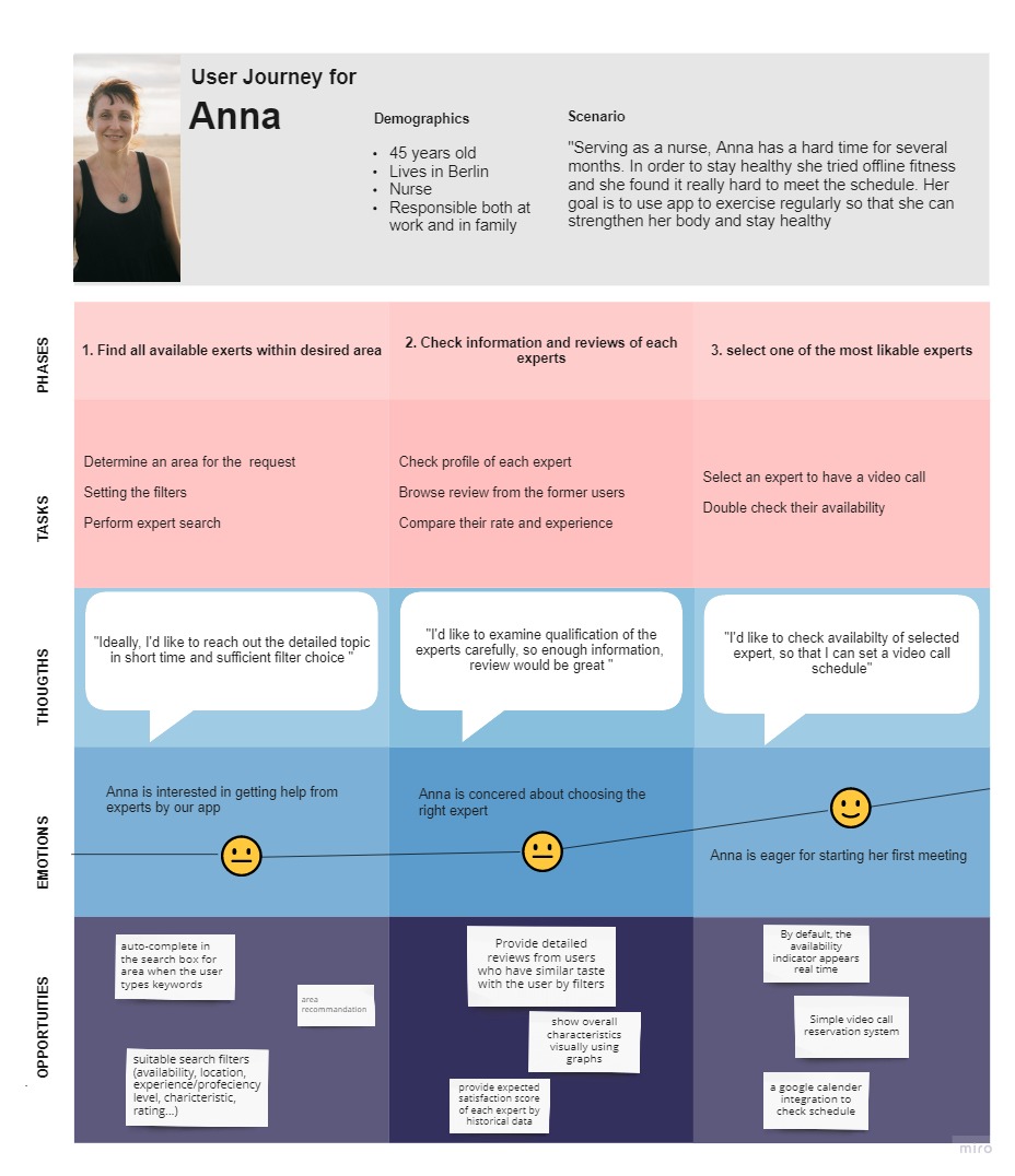
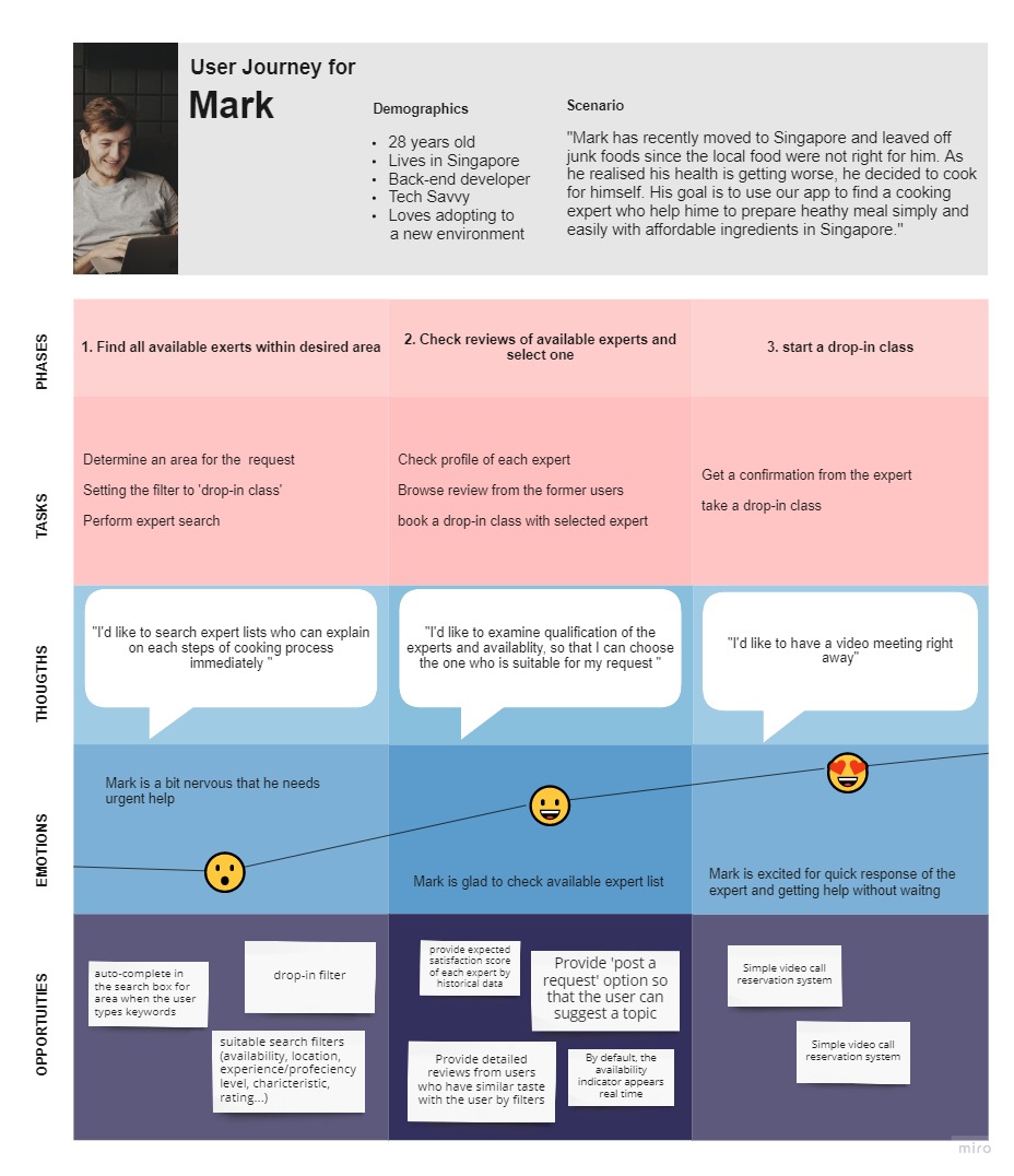
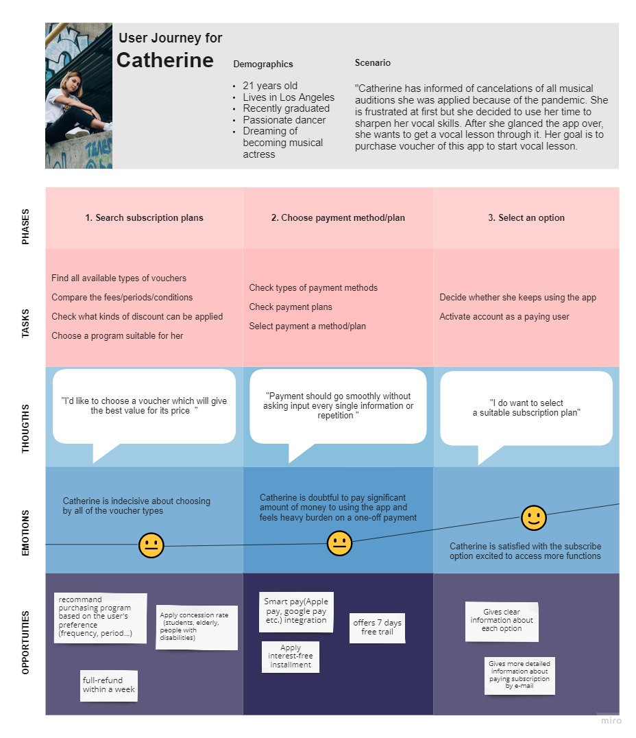
Focusing on the goals of these personas, I created scenarios and user journeys that illustrate how they move through the process. Understanding the personas helped significantly to provide opportunities for creating better user experiences.


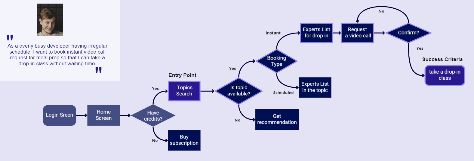
I defined user flows for each feature to understand and meet genuine objectives and the needs of the respective persona. Alternate paths can also be taken in each flow. Using these user flows, I carried out low-fidelity prototyping and tested potential solutions through usability tests which will be explained at a later stage.


information architect
Card sorting was used for testing the psychologies of real people regarding the information architecture of the potential solution. The card sorting iterated 2 times to reach the final sitemap because I noticed that many people were confused about several categories. In the second test, the choices of participants appeared consistent across the board.
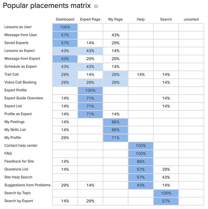
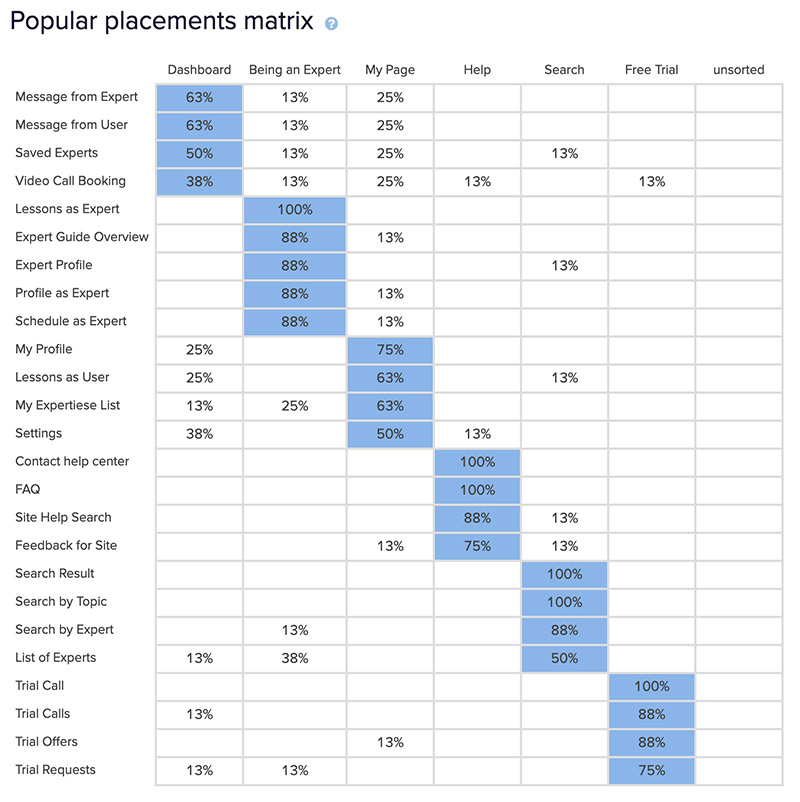
By asking the users to organize items into groups and assigning categories to each group, I could create and refine the information architecture of the app by exposing the user's mental models. It also provided quantitative data which helped me to make decisions and prioritize resources.
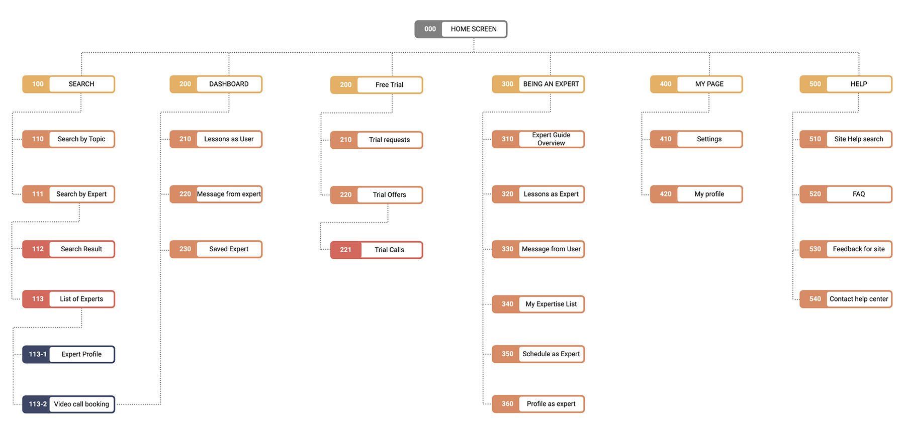
However, there were still some glitches the user may encounter with this sitemap, so I created “Video call booking” tap which can be accessed from the “Dashboard”. By adding detailed instructions on the “Being an Expert” page, people are able to differentiate between the “Expert Profile” and “My Expertise List”.
Responsive app design plan
I used Mobile-first to design a responsive web application. This application automatically manipulates and transforms web pages to optimize the structure of content with respect to the type and size of the device that they are being viewed on. I recorded a list of content based on the needs of user personas and I repeated this process for the “Tablet Content” and “Desktop Content” sections by using a progressive enhancement process.
usability test
The goal of the usability test was to access the learnability, efficiency, satisfaction, and error for first-time users. I observed and measured interaction with the initial prototype of the participants from the sign up to completing 3 main features of the app: search expert, try drop-in call, choose/payment for a subscription plan. The objective is to check whether users understand the basic features and feel happy with it from onboarding to the main tasks.
Moderated remote is a main methodology of the test, using zoom and guick time player for screen sharing and recording.
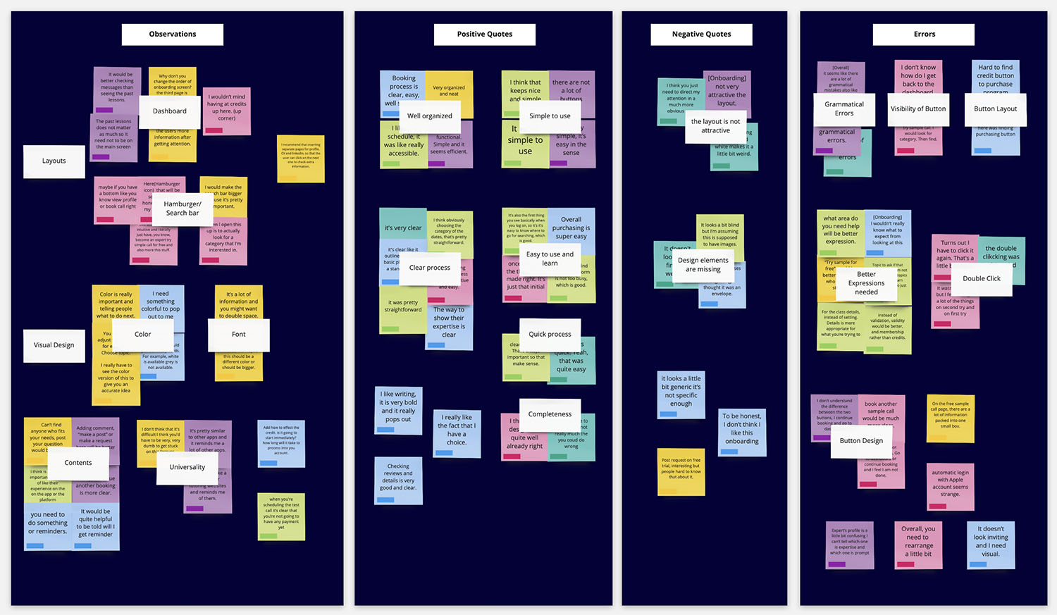
Test Result:
The test was successful as it provided a great insight into the users’ interactions and issues I should fix to make the app better. During each usability test, all 6 participants were able to complete the 3main tasks and gave different kinds of feedback. I set up action points for every single observation with a rainbow sheet and 5 issues among the results were chosen to improve the usability of the app within finite resources by its severity.
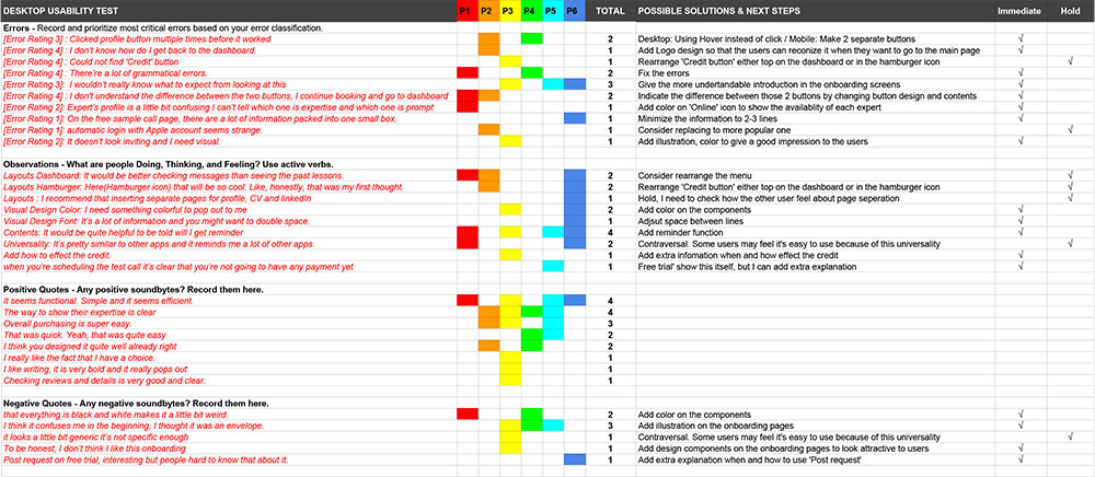
iteration
Issue 1: It is frustrating to have to click the same button multiple times before checking the profile and the booking
Some test participants were not sure how to view the profile, and it took some time for them to find it. One of them requested that we add a direct booking button on the preview screen.
Solution: Add a ‘book a call’ button for checking detailed profile, separate buttons
Issue 2: The difference between the two buttons after a booking is unclear. (Severity : )
Most of the participants hesitated before selecting a button to click for the next task. Also, they commented that they were confused by these two buttons.
Solution: Indicate the difference between those 2 buttons by changing button design and contents
Issue 3: The users can’t find a way to return to the Dashboard from the current task.
Some test participants didn’t notice the logo button on the top.
Solution: Add Logo design to make it noticeable to the users so that they can recognize it when they want to return to the Dashboard.
Issue 4: Users can't find the ‘Credit’ button.
Most of the users were not sure where the ‘Credit’ button was located for choosing a payment for a subscription plan.
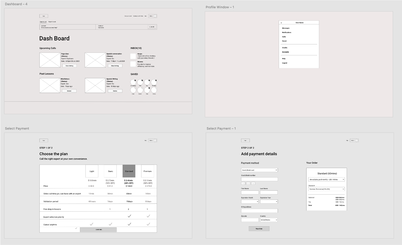
Solution: Rearrange the 'Credit button' to the top of the dashboard for the desktop version and in the hamburger icon for the mobile version.
Issue 5: The Onboarding screens were not effective in conveying basic information.
Instead of spending enough time on onboarding pages, test participants tended to skip them. Some of them left comments that they wouldn't know what to expect from the pages.
Solution: Add illustrations to the onboarding pages. Give a clearer introduction on the onboarding screens
The others: There are a lot of grammatical errors.
Some users complained about the errors above anything else.
Solution: Fix all the errors
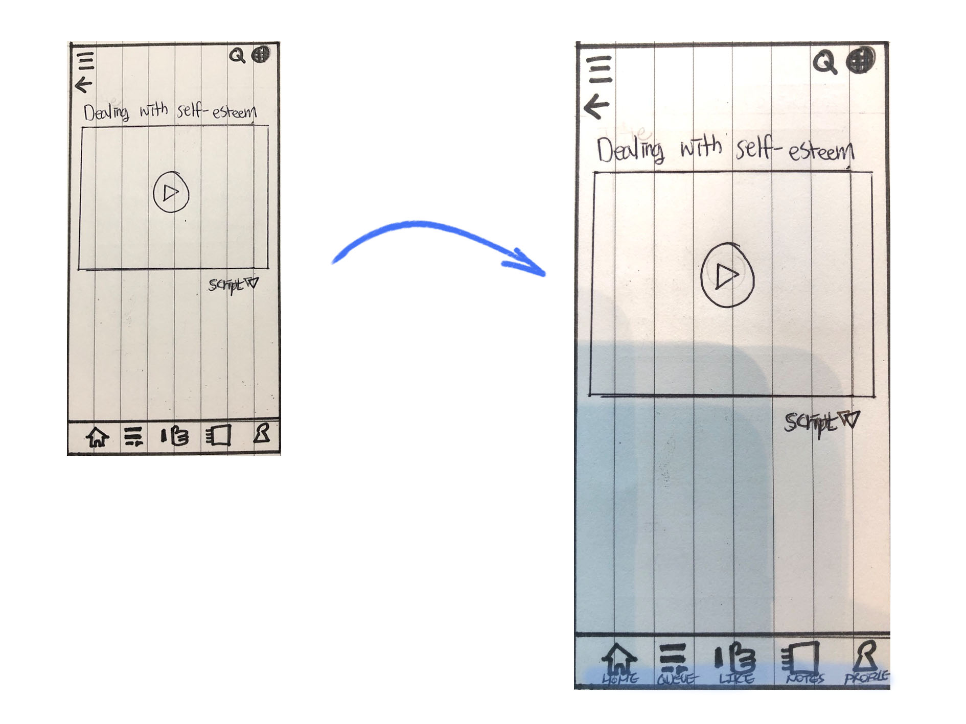
Key Finding #1: People don’t always understand what icons indicate
Some test participants didn’t know which icon to click on in the navigation bar at first. However, once they found it the process was smooth. Adding labels on the navigation bar would help users navigate the app more easily.
Key Finding #2: Unclear terminology ruins the user experience
Several terms used in the buttons were not clear enough to indicate their function. People got confused about what “choose a topic” meant and didn’t know it would take them to a video. So I changed it and replaced 'Domain' to ‘Fields’ on another screen.
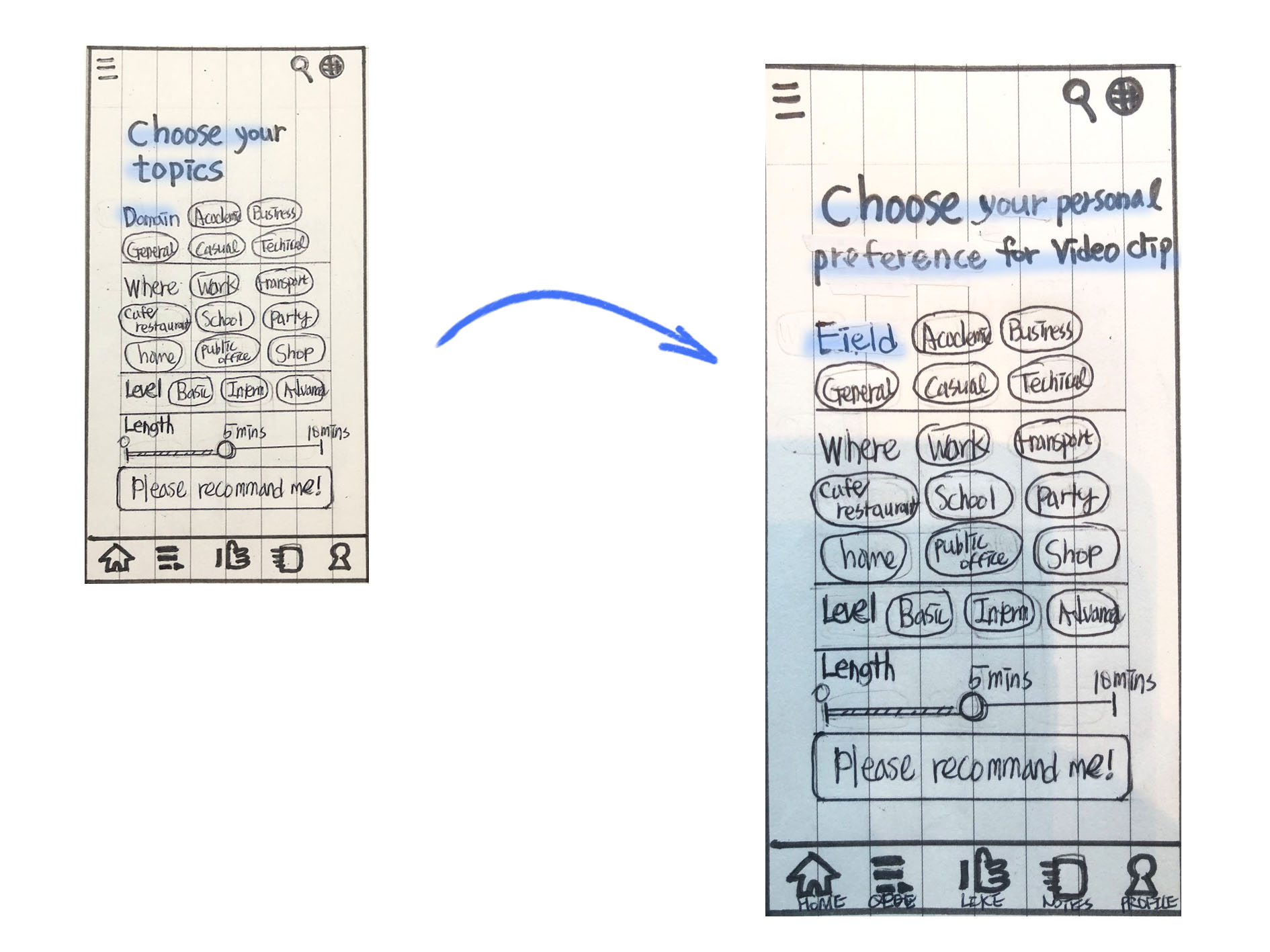
Key Finding #3: the size of CTA buttons affects users’ behaviors
Some users were not sure if they needed the “another clip” button, since the "you may like" section was almost the same feature, and this overlap confused them. I changed the location and size of the buttons to make them work exclusively. (Remove “Another clip” button and make “Review Words” button bigger , Replace “Add to my note” button to “Return to the video” button)

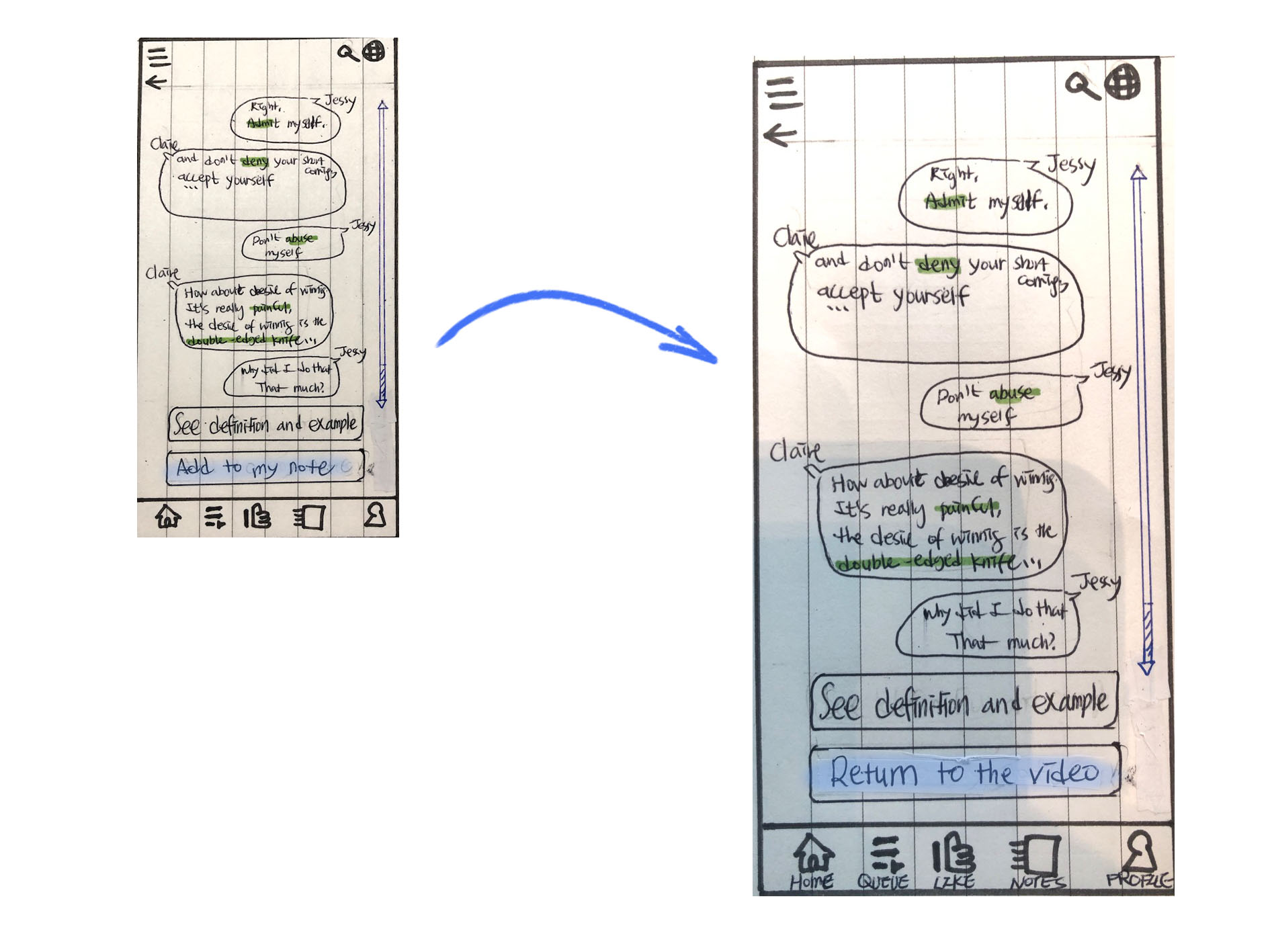
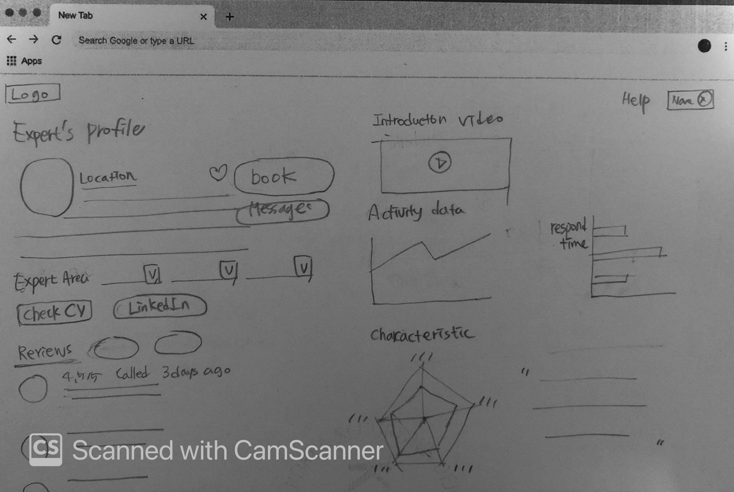
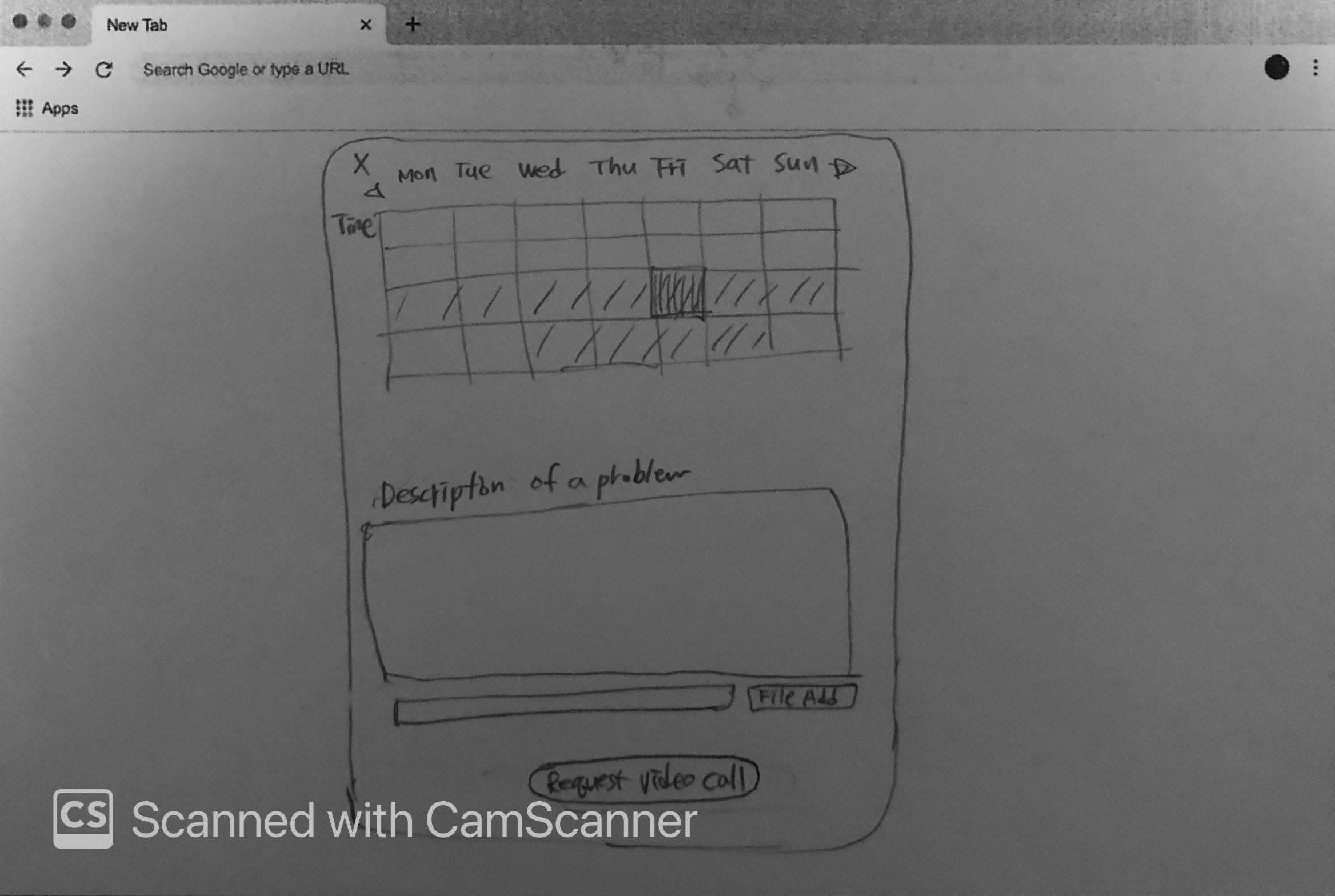
Initial design
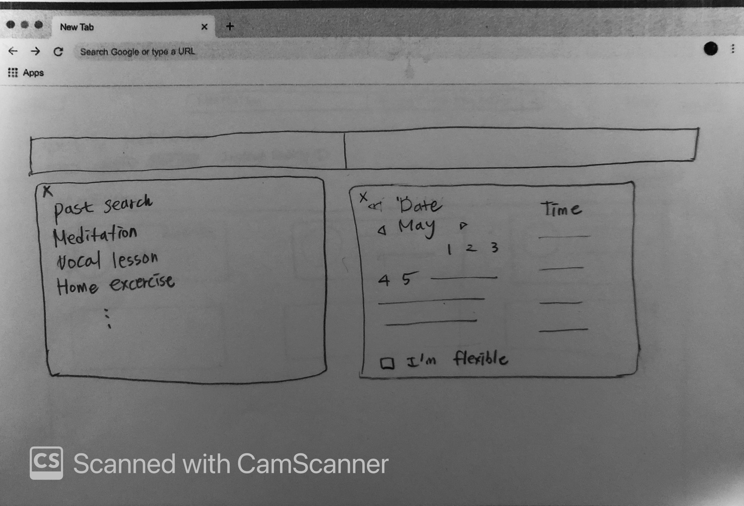
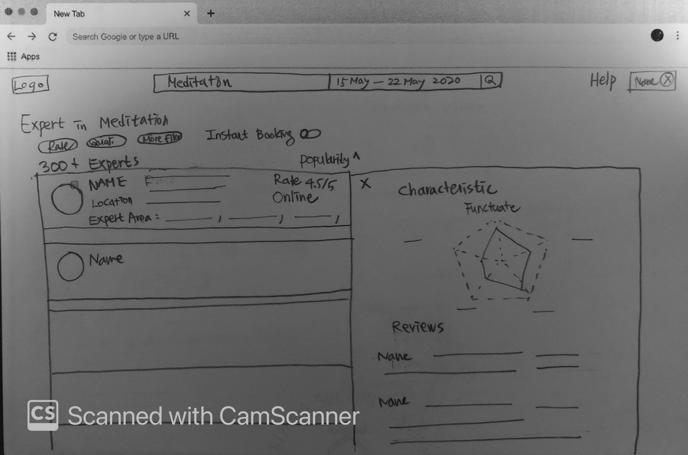
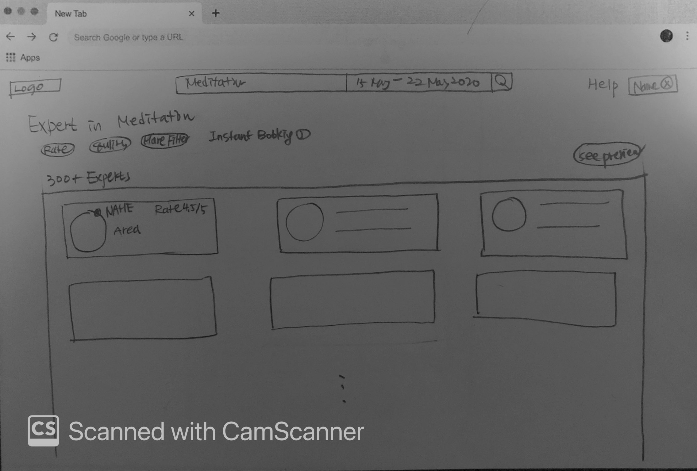
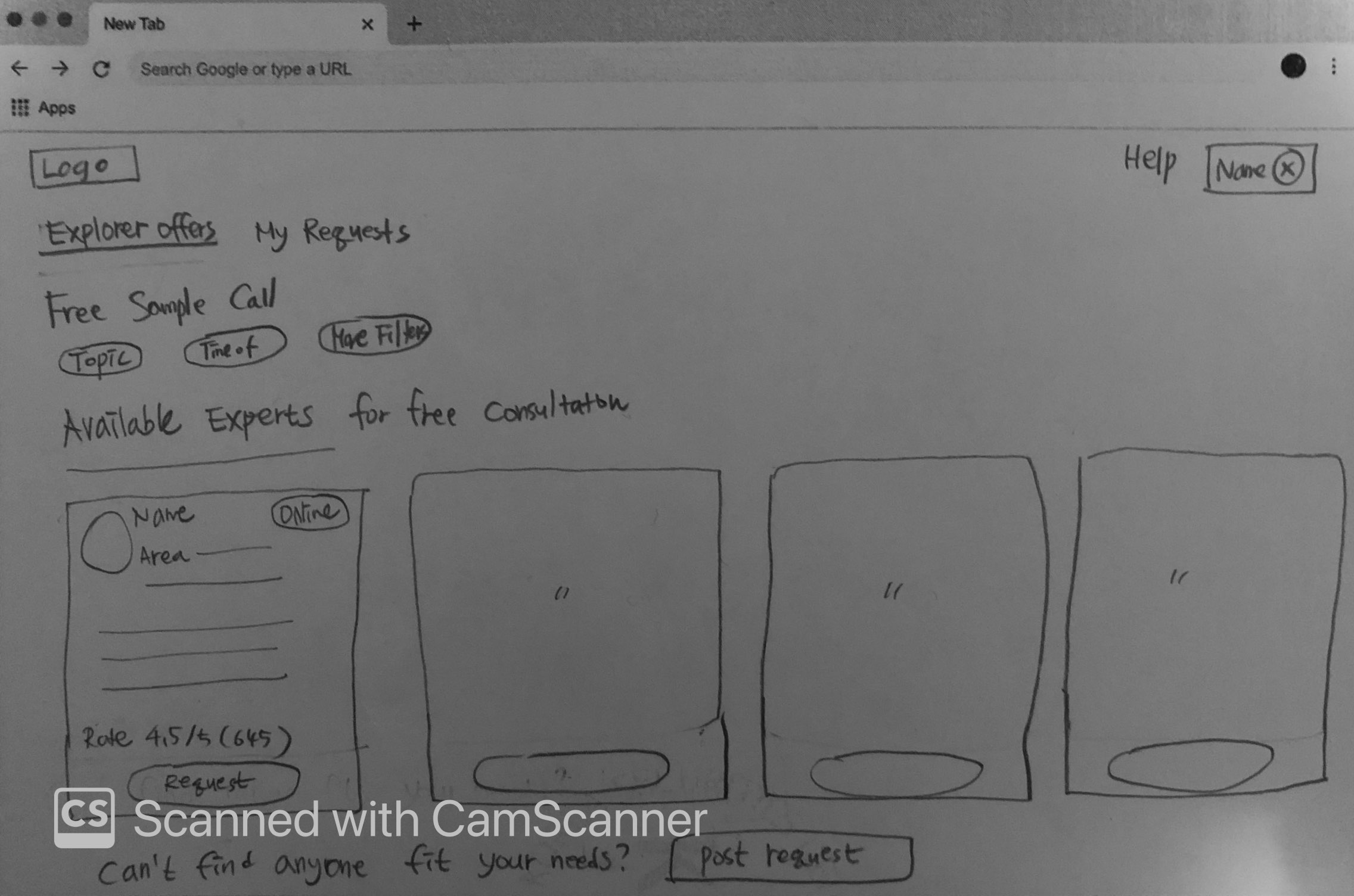
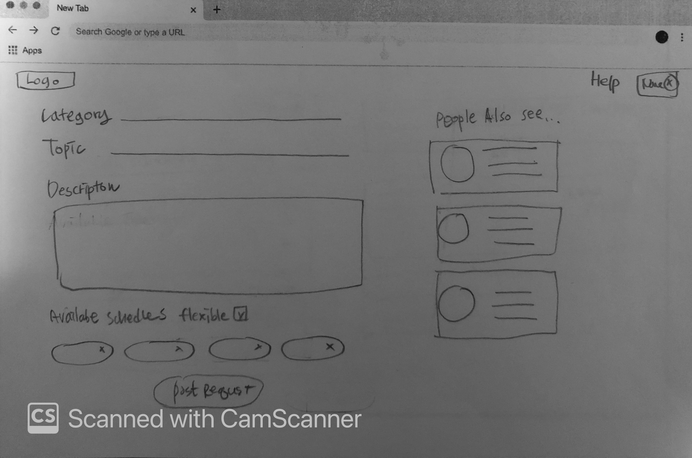
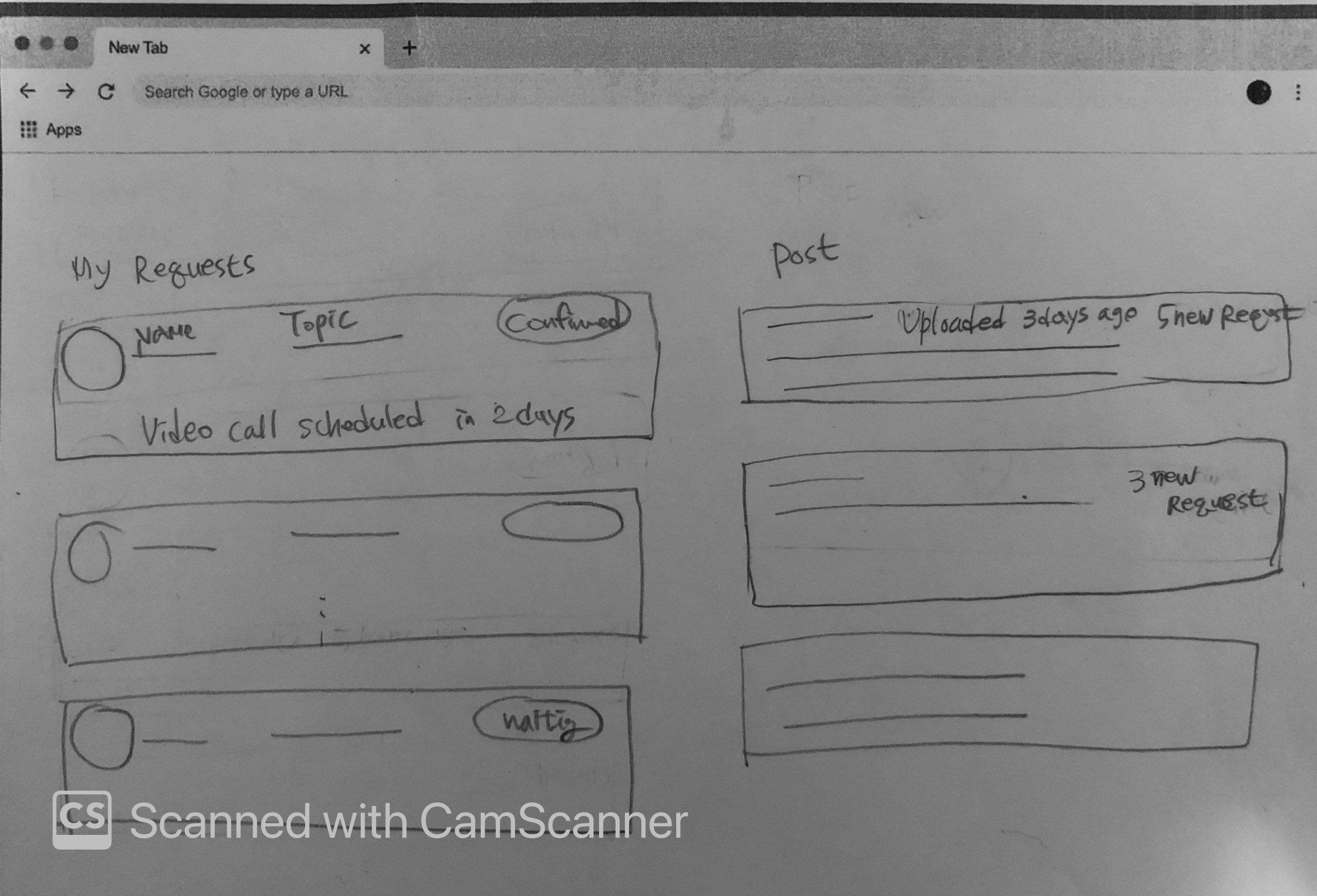
final design
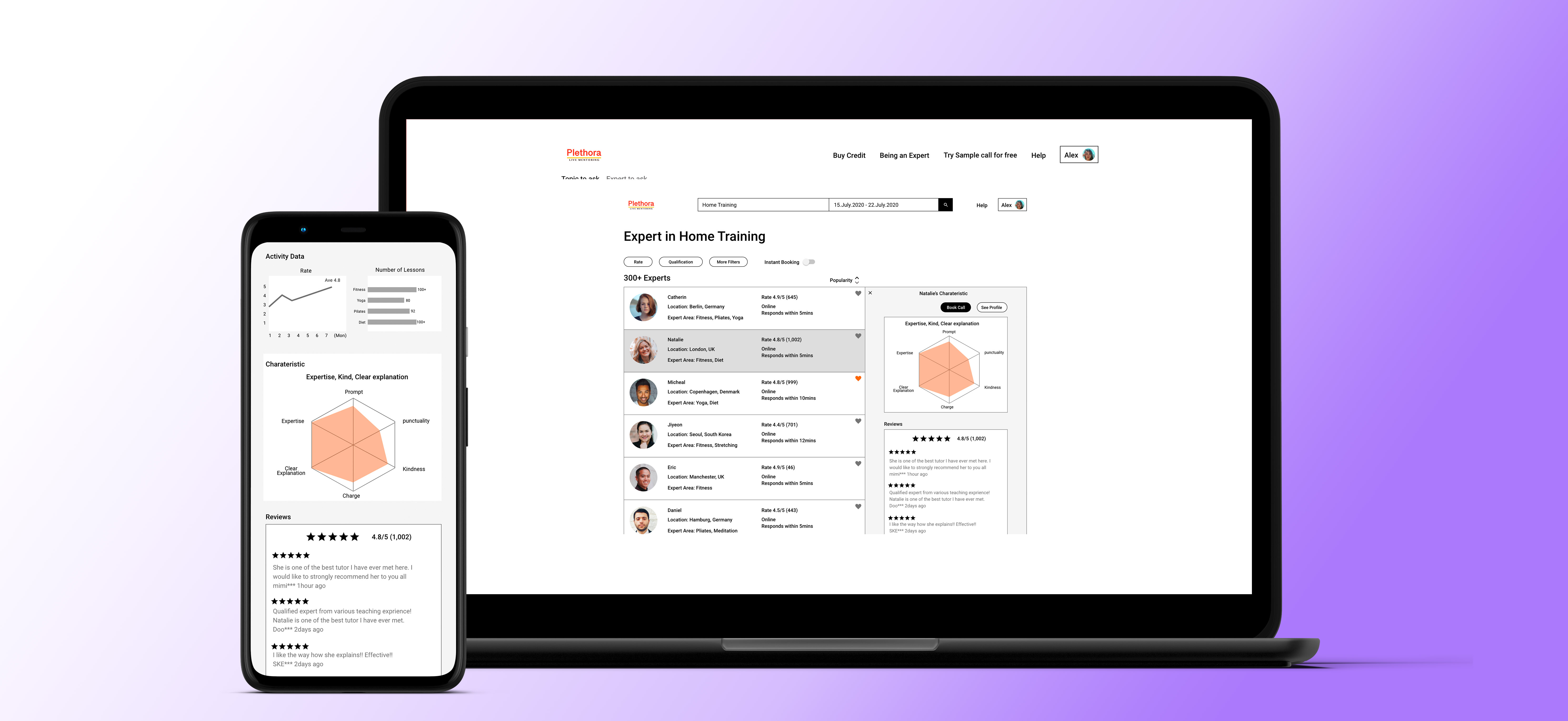
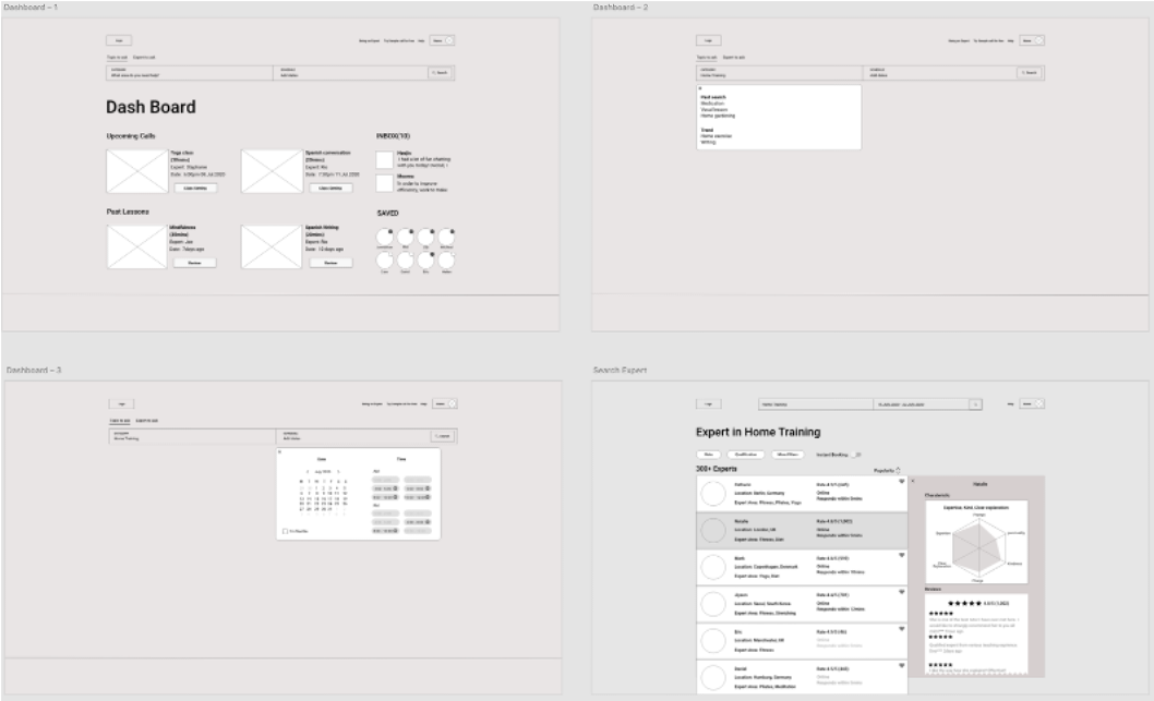
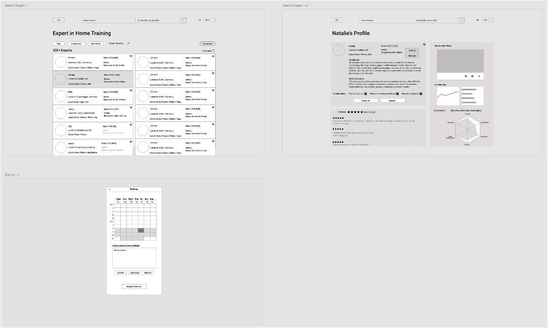
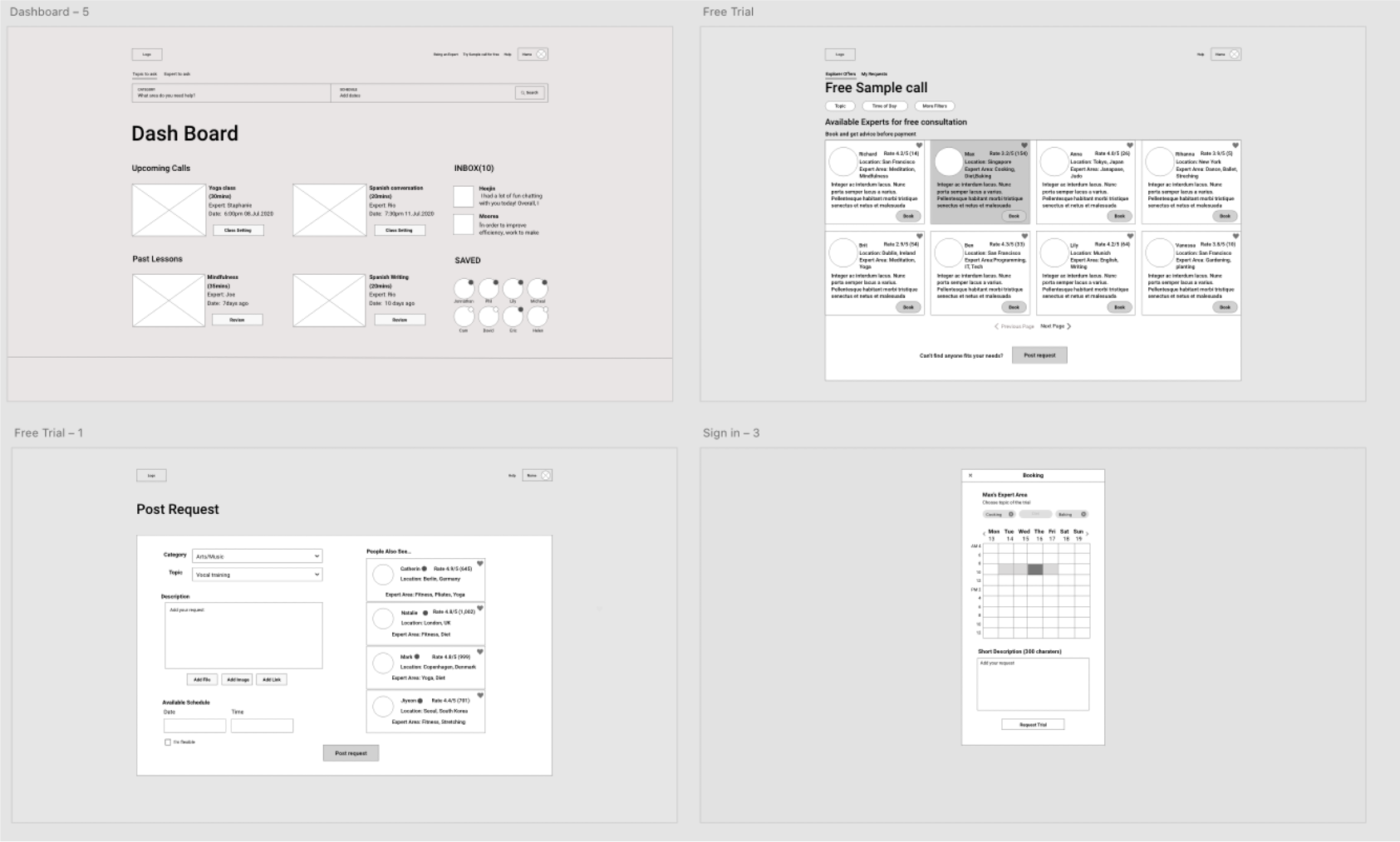
The Expert Search is one of the most key features of this app. On this feature, the user takes the initial decision on how to find a proper topic and expert who can help them best. However, it was a bit challenging how to make the search process effective. I decided to make the search bar simple and show all available experts list first. Once the user finds an expert looks interesting, the user can check his or her expertise intuitively within one page including accountability of their skills. Throughout the iterations, I made a well-organized expert introduction with enough amount of information displayed.
.gif)
.gif)
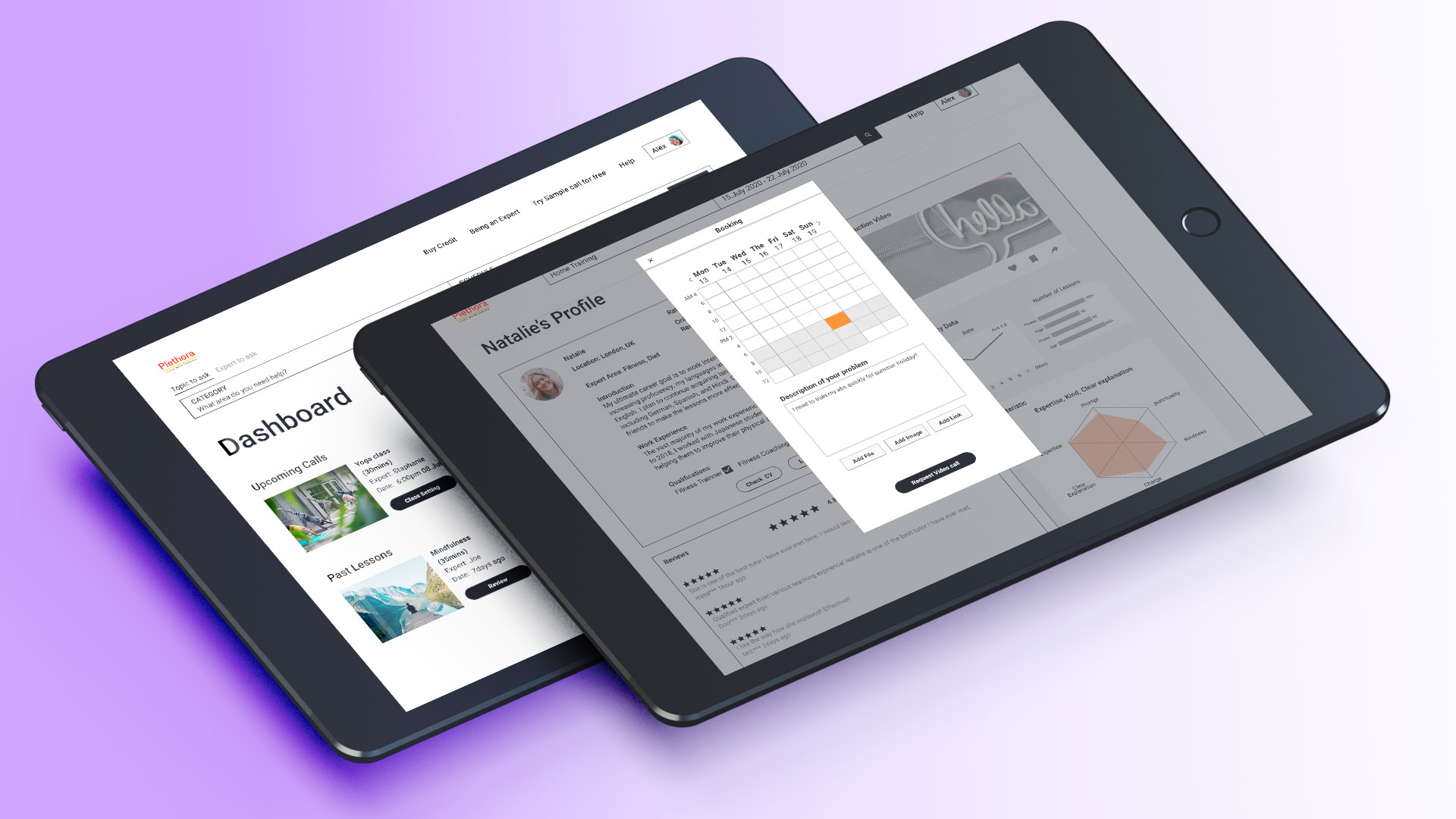
In this feature, I have changed the title from Try sample call to Free sample call because I found that a few interviewees got confused what’s the difference between sample call and regular booking. Moreover, I add additional functions which are Post Request after user interview and usability test for two-way communication in case the user cannot find a proper mentor or topic available, then they can ask mentors their request by post in detail.
.gif)
.gif)
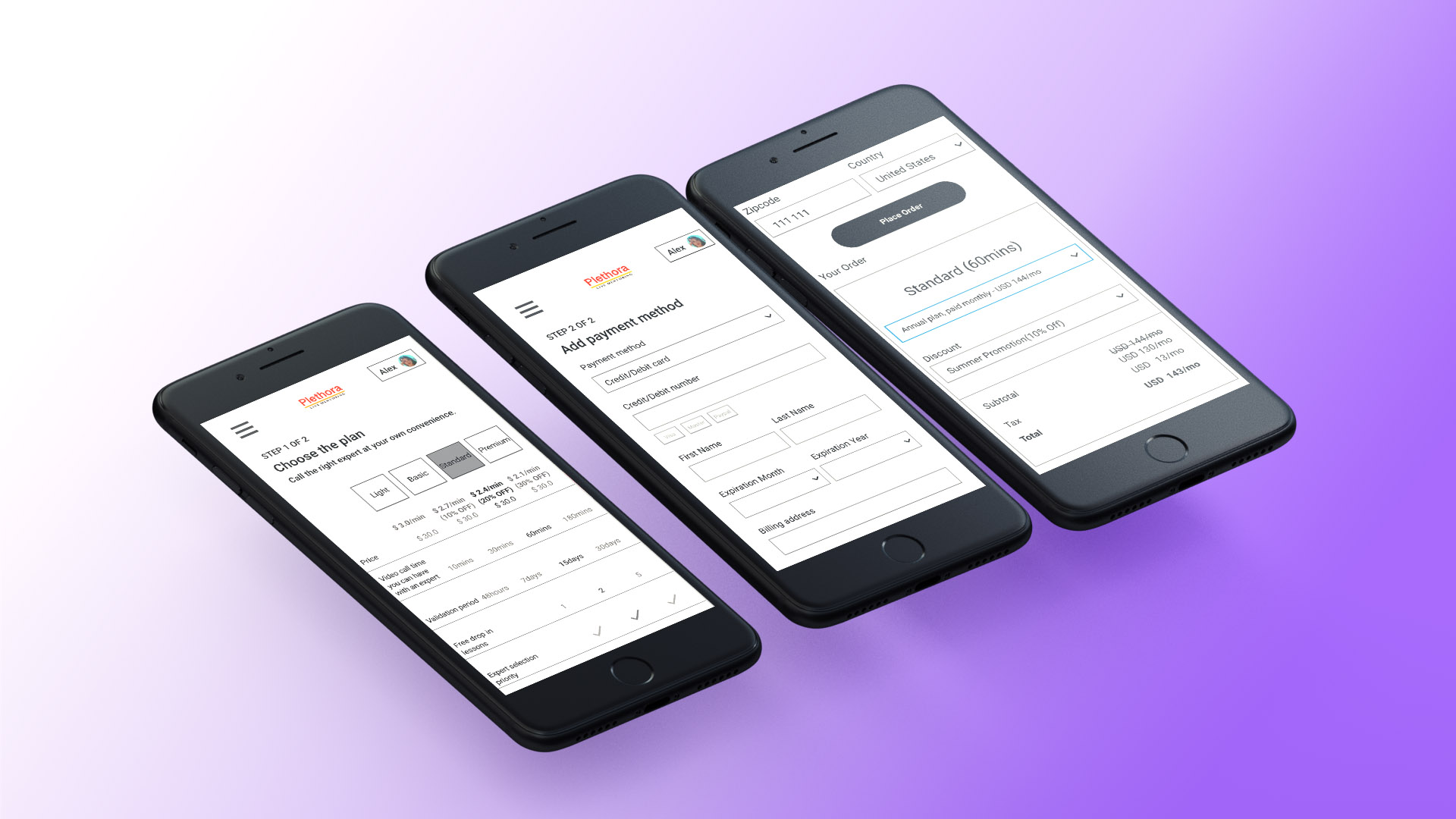
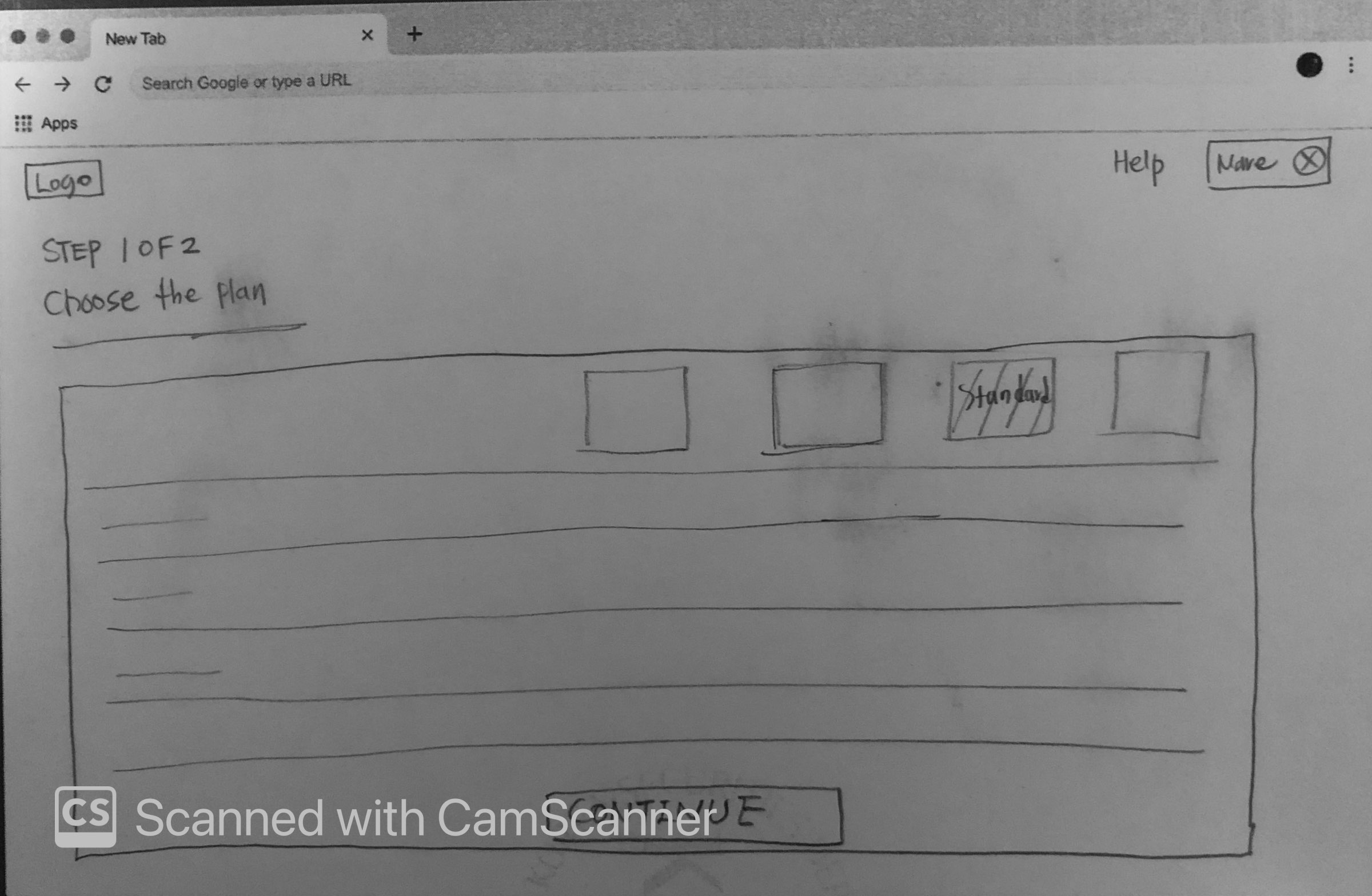
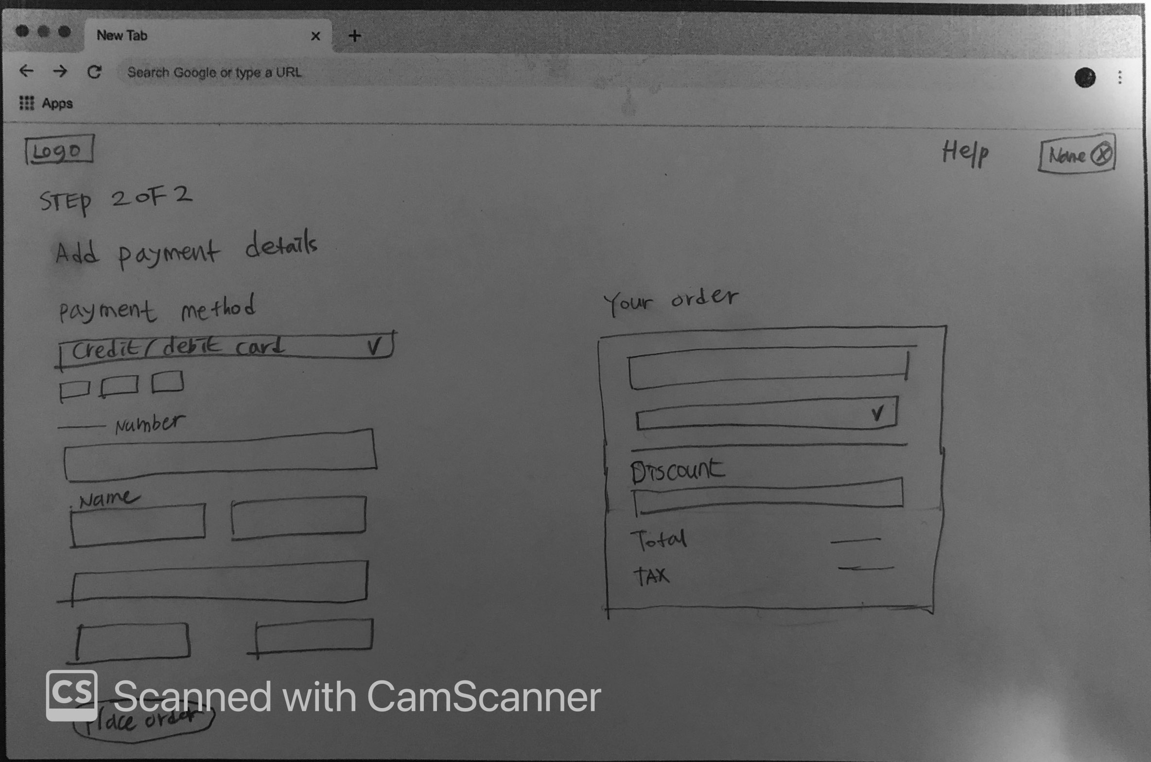
Initially, I did not have an idea I need to separate pages for alerting the result of the payment. Throughout the usability test and user interview, I realized the fact that the user wants to know the payment process is successfully done. Additionally, small adjustments on the button as CTA, it was not clear what happens if the user clicks it, so I adjust the text on the button to convey the clear function of a specific button.
.gif)
Retrospective
Further improvement
Through this project, I was able to experience every step of the UX design process. Although it was not a small amount of work, I’ve gained significant insight by practicing a design flow from user survey to prototyping. For further improvement, I would like to spend time on adding UI assets to this project.
Next steps
I would like to monitor and analyze actual user data using tools like Google Analytics when this product is going live as well as monitoring it. The significant amount of user data will give more valuable insights to drive the entire project towards a better direction.